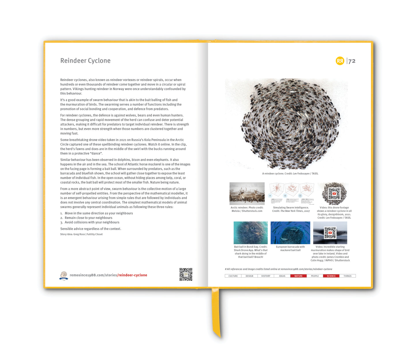
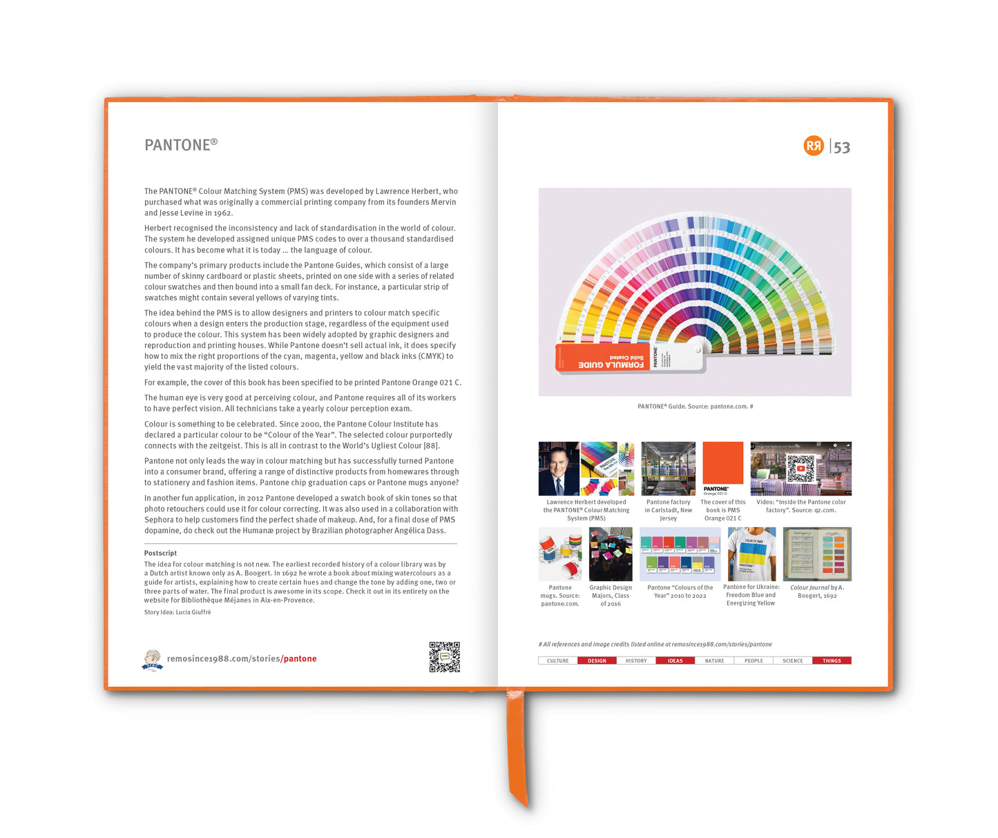
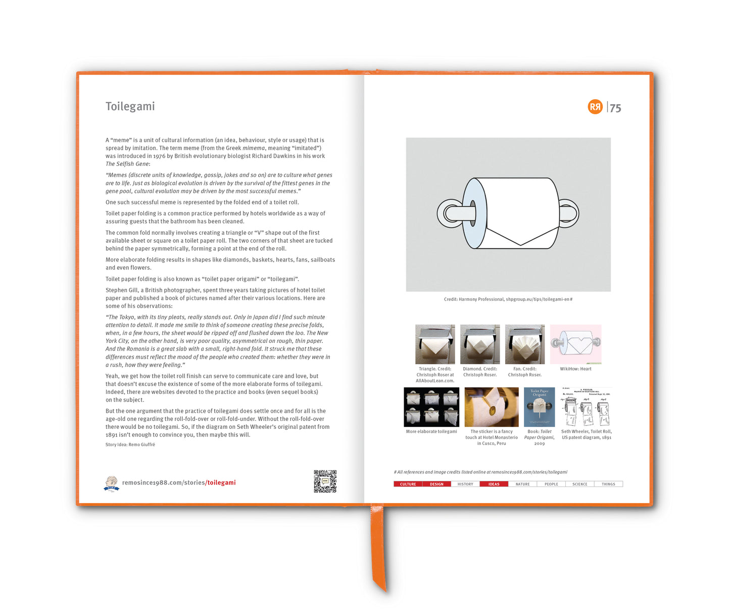
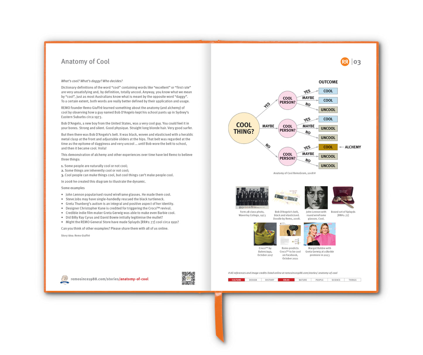
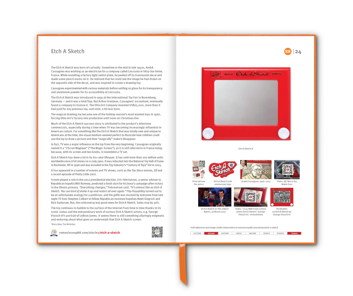
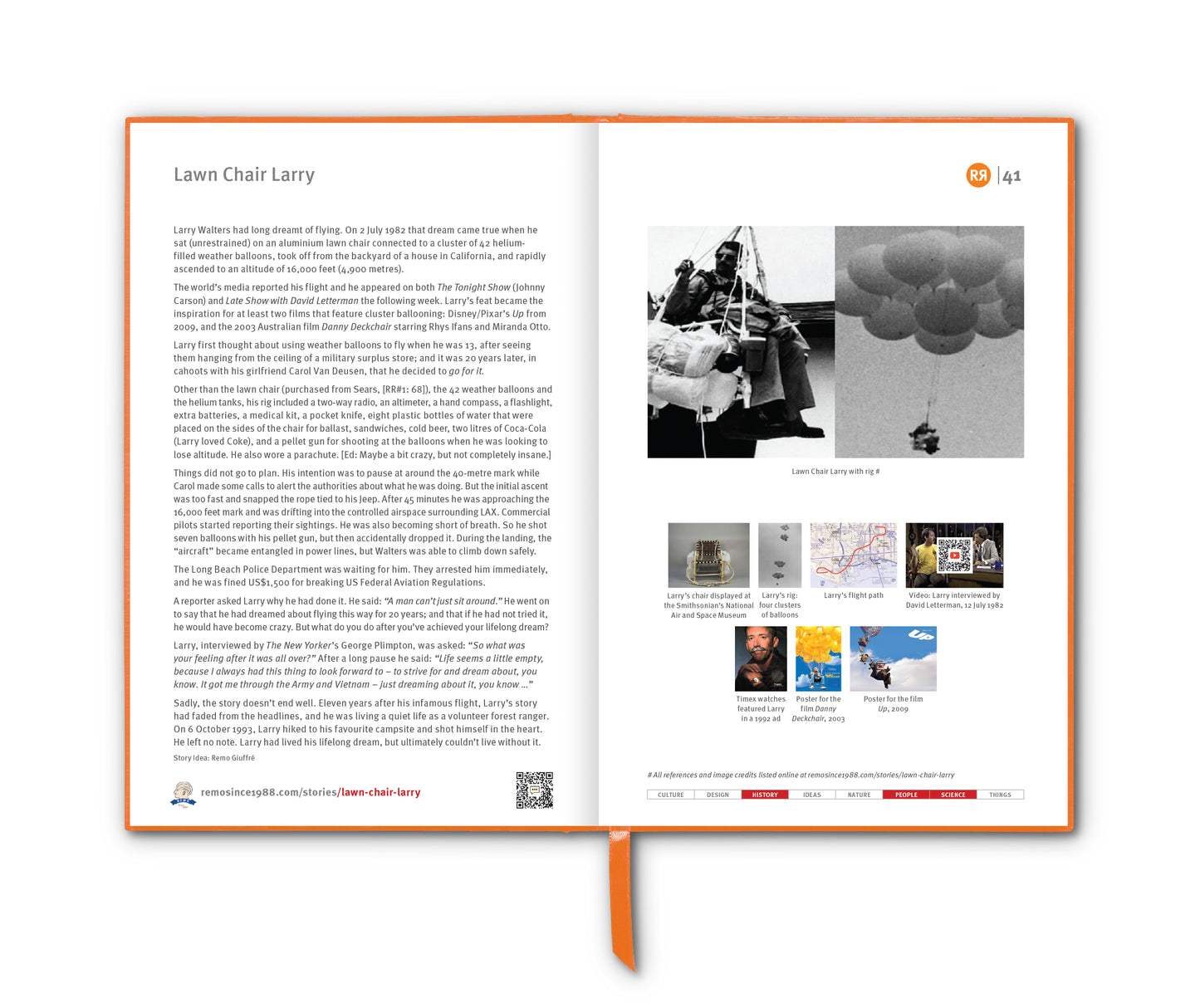
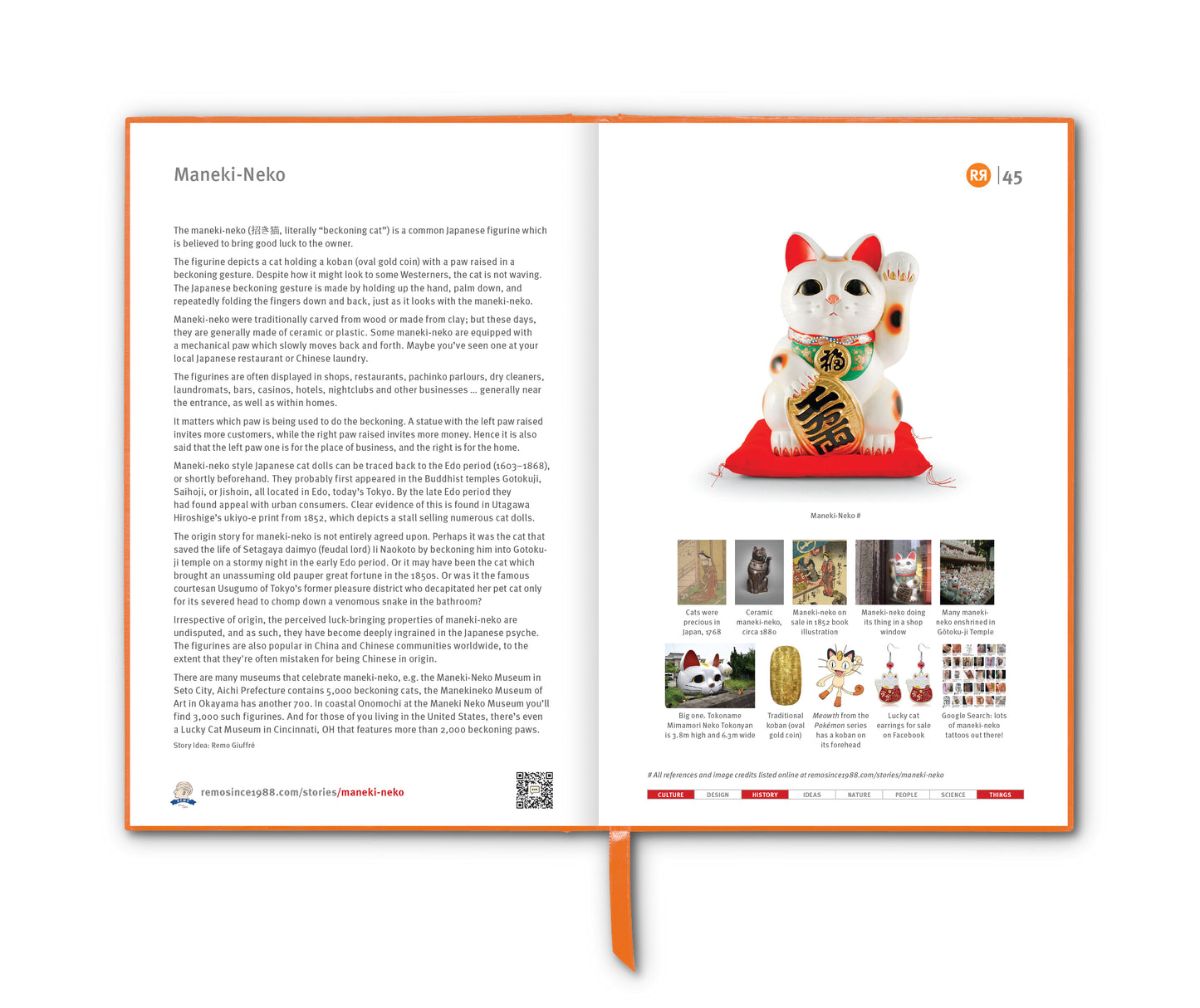
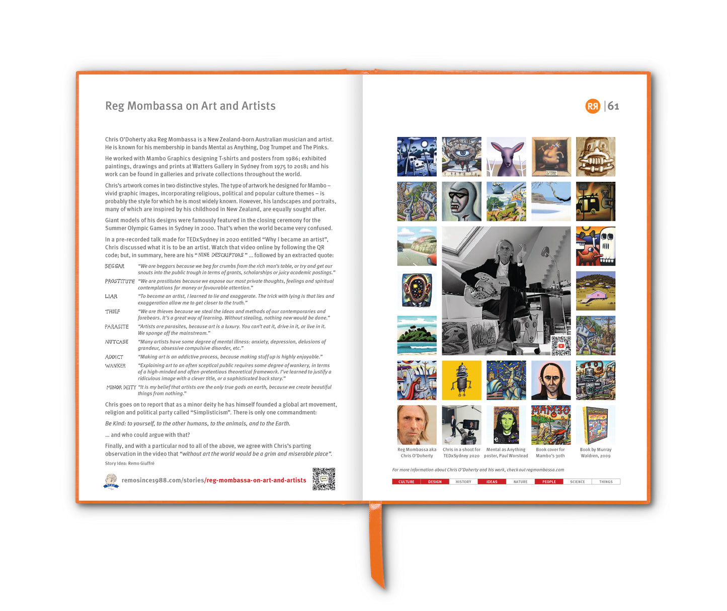
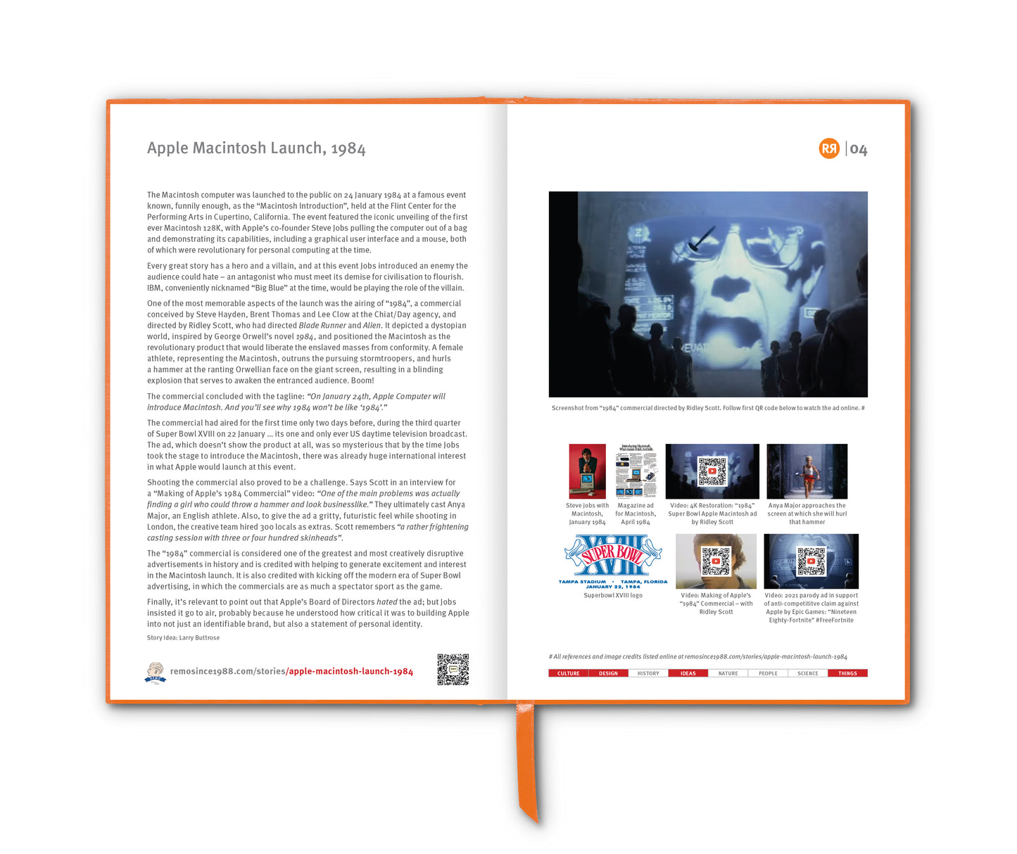
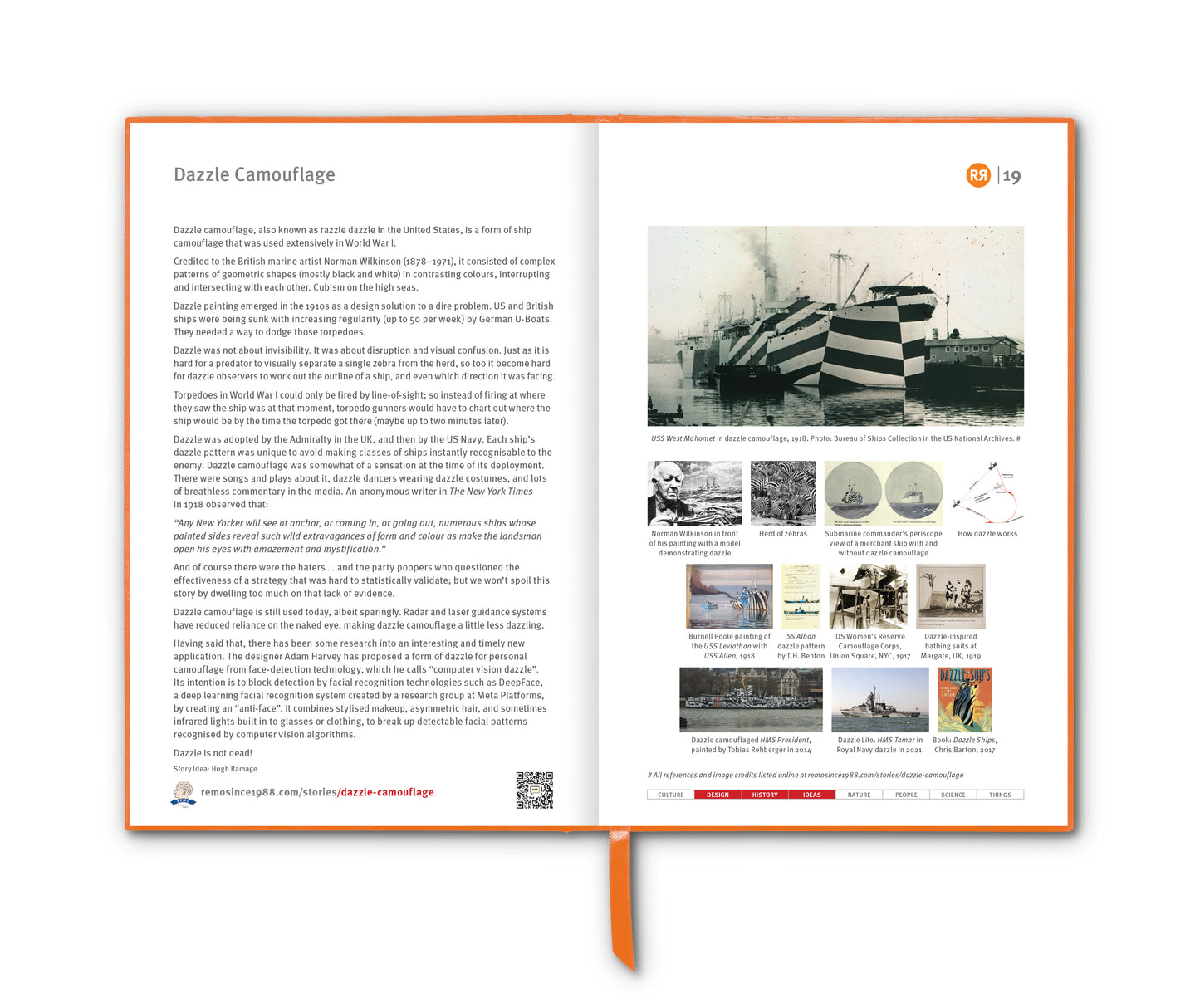
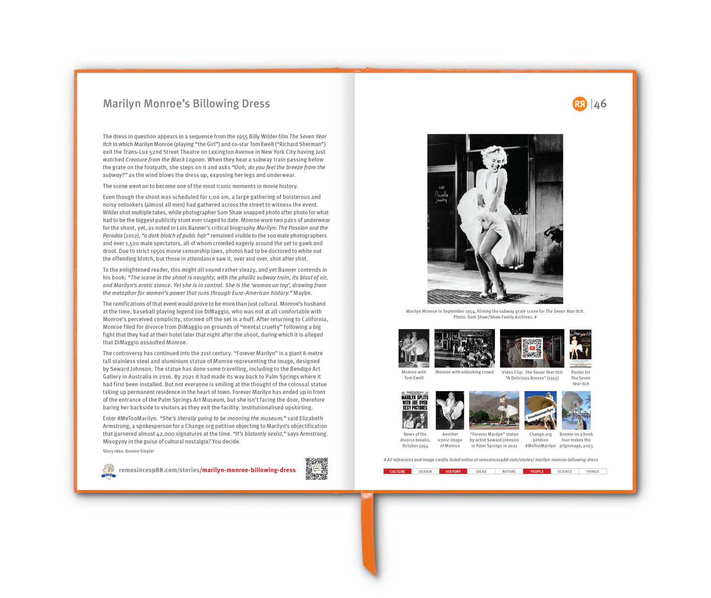
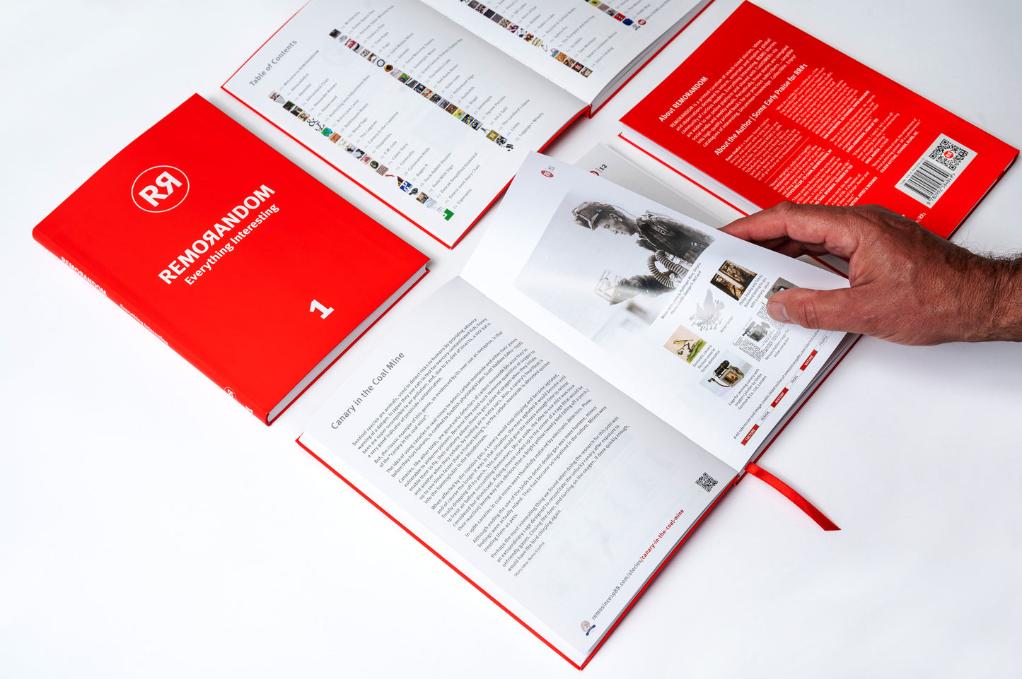
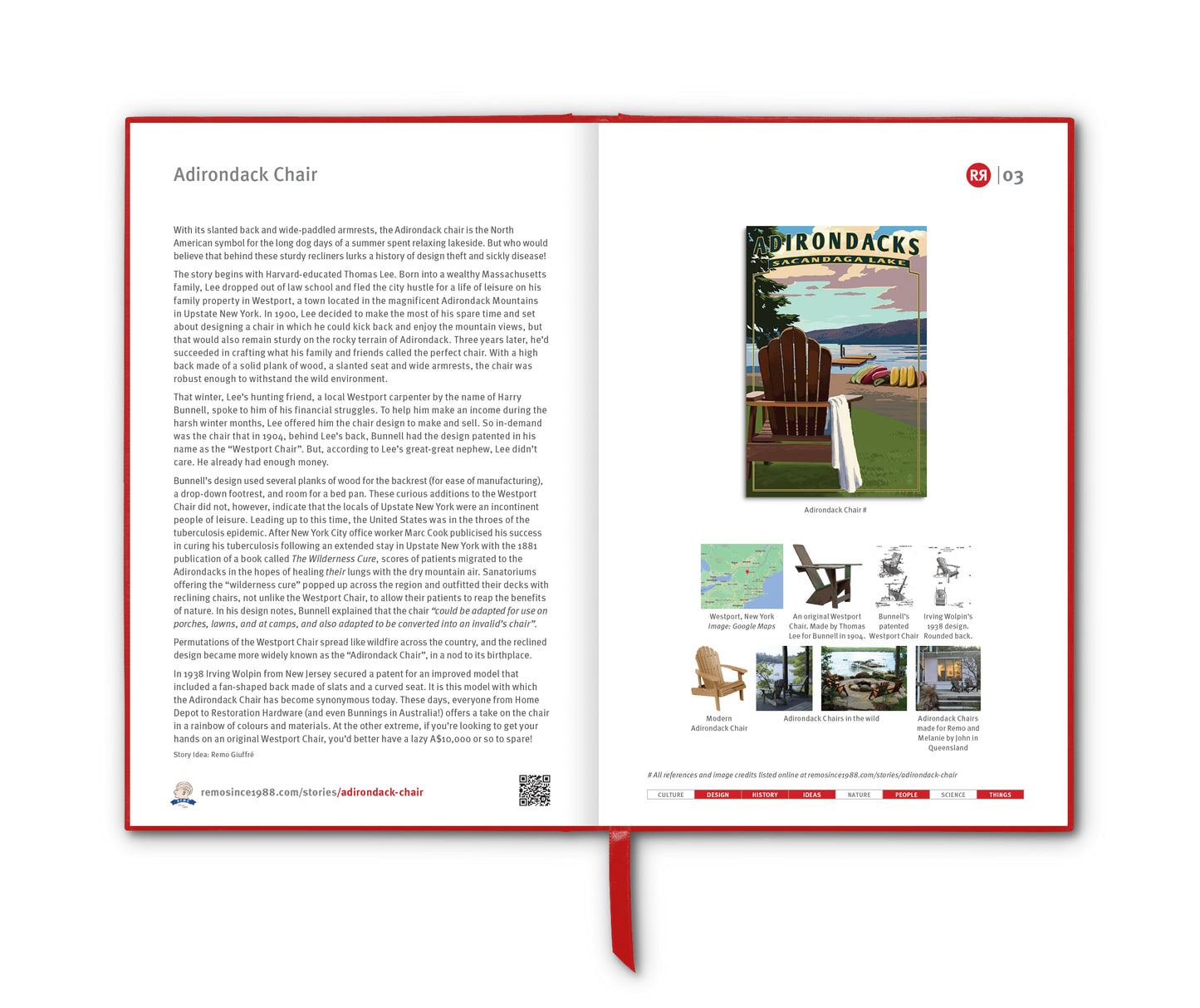
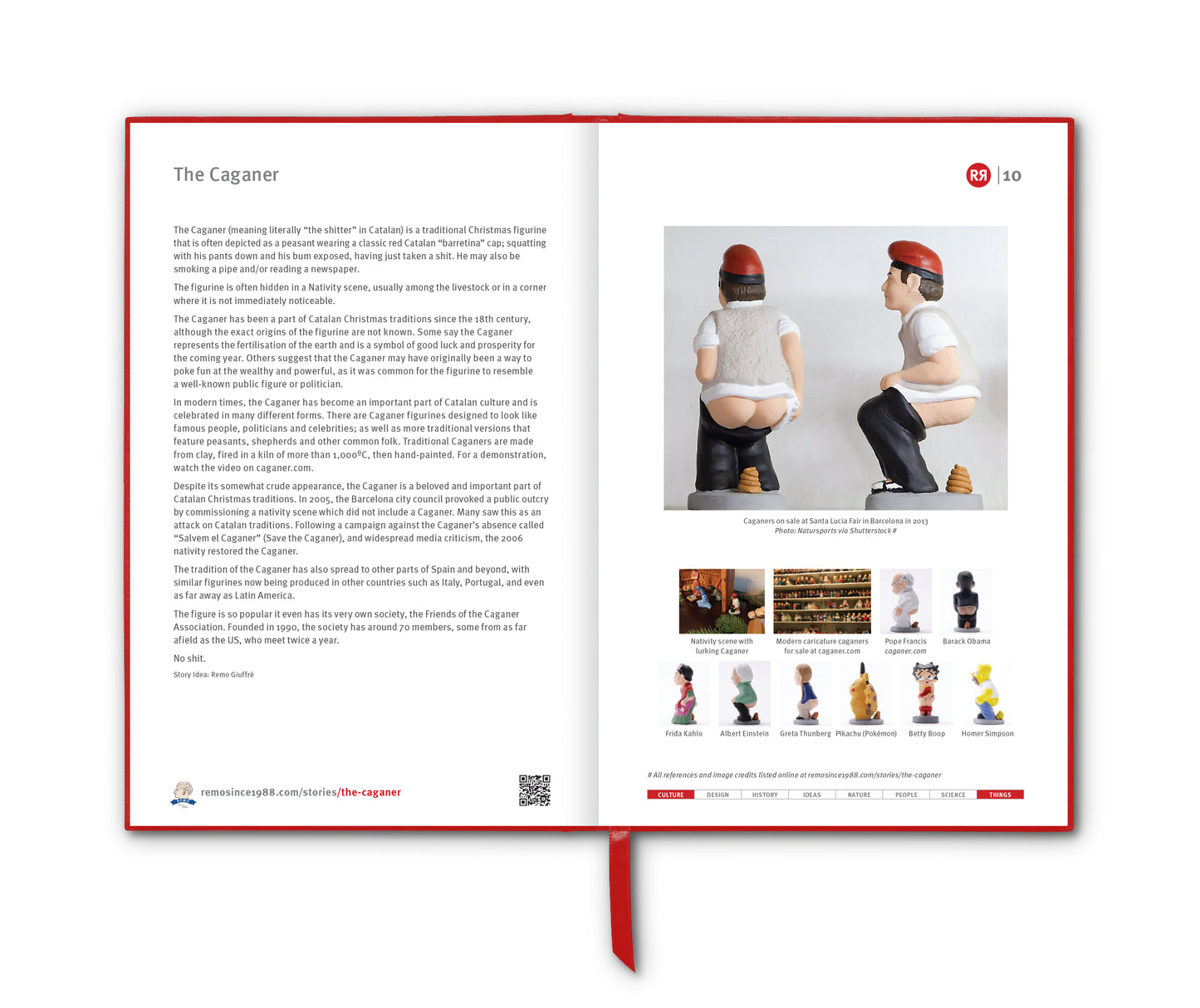
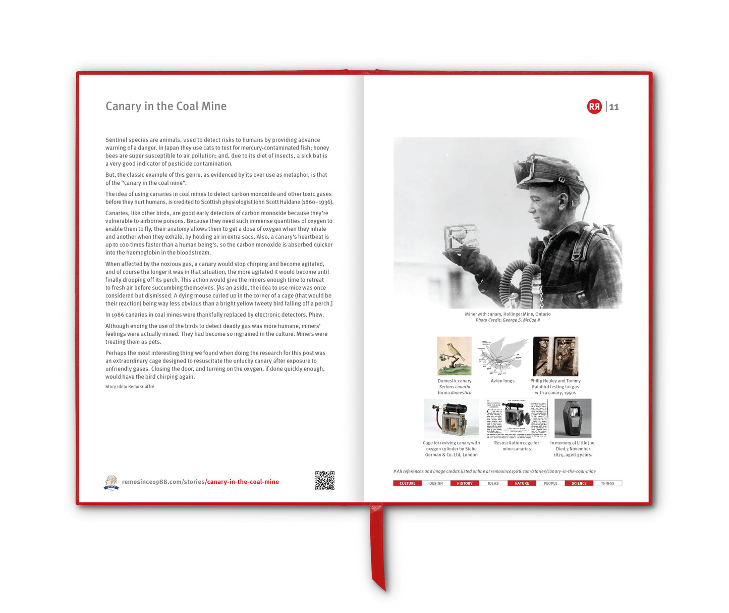
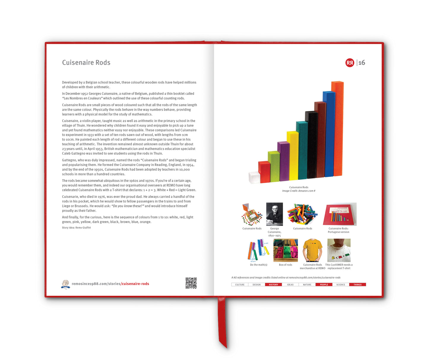
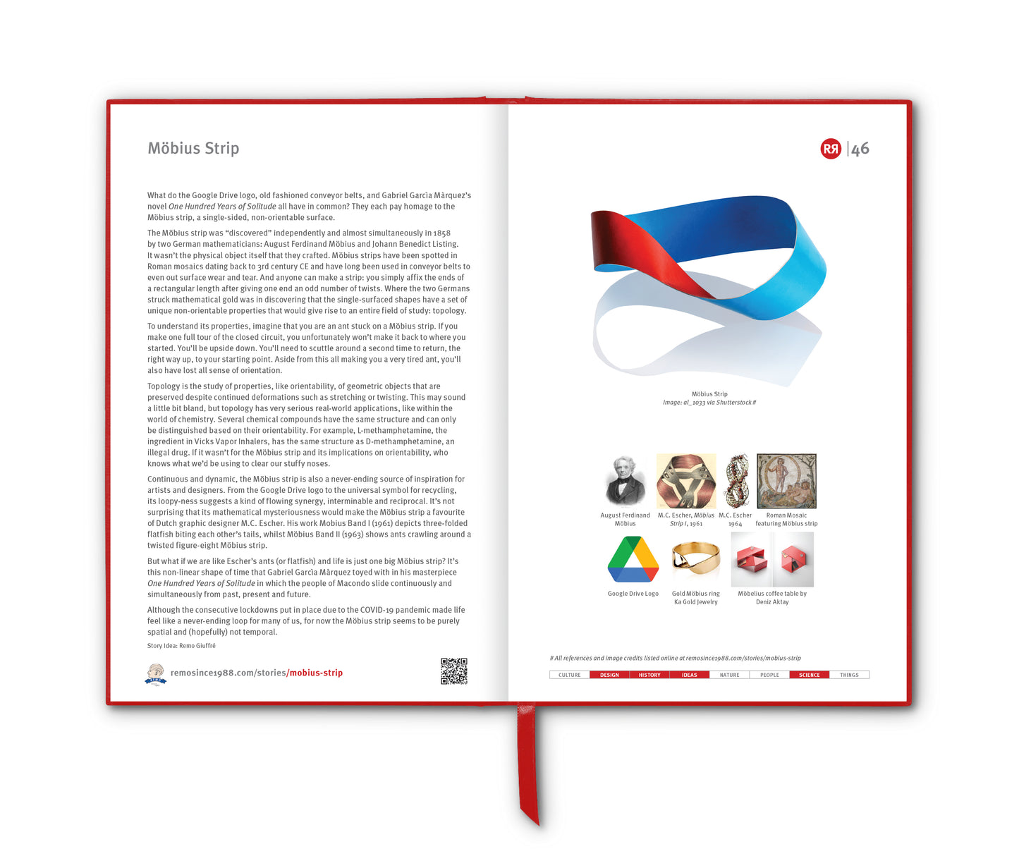
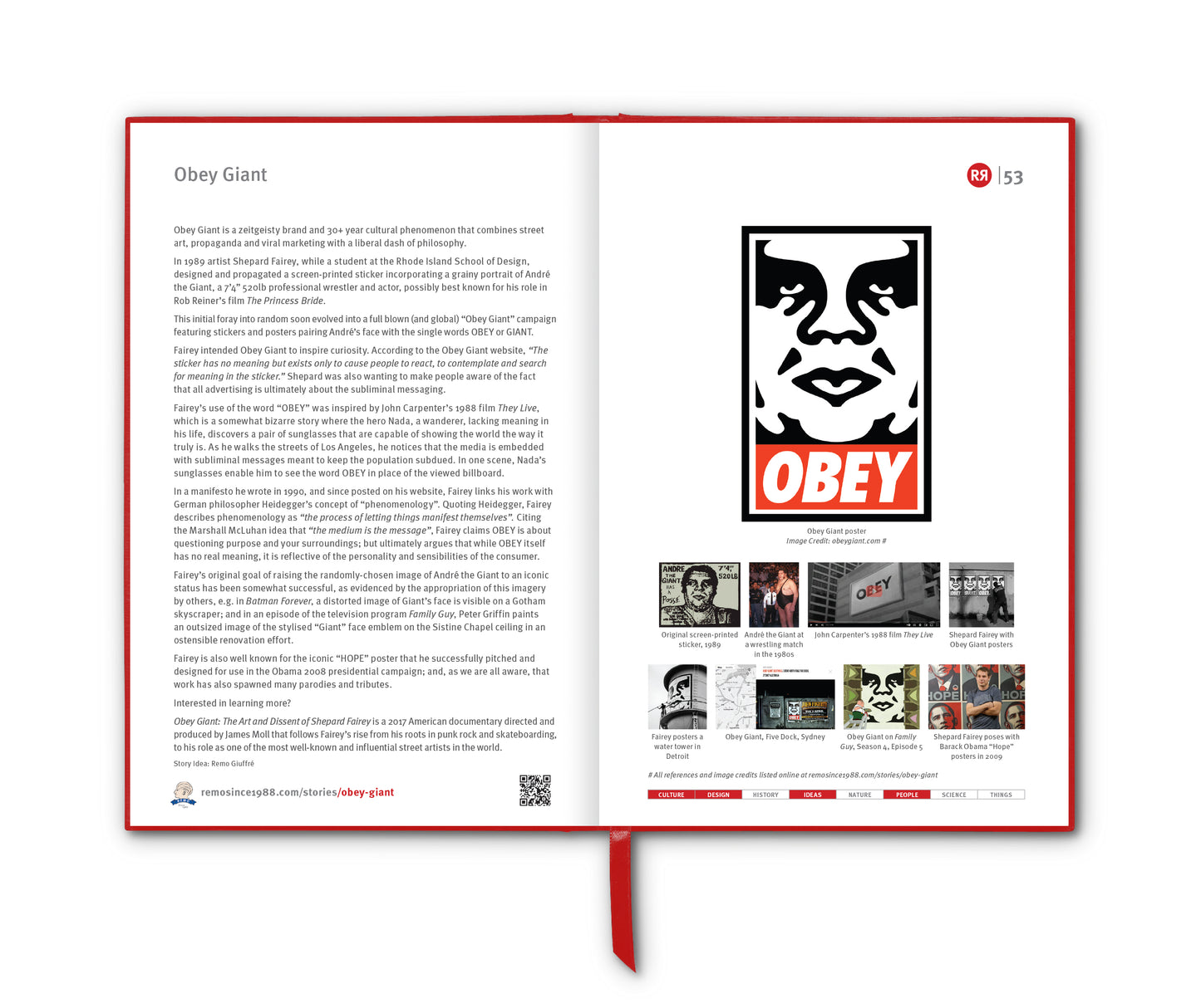
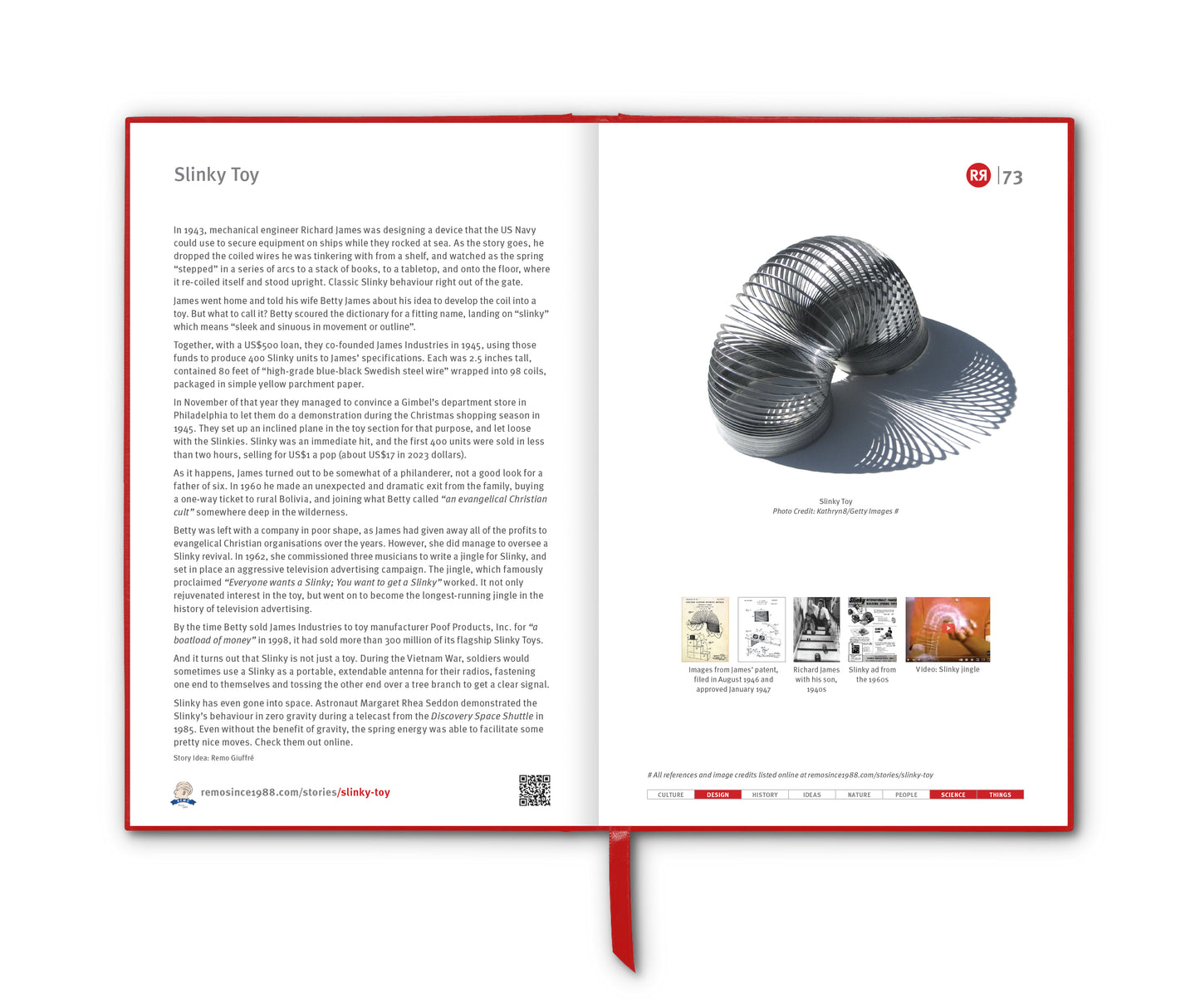
HERE is the original General Store version of the REMO head logo.

It was designed to represent US as well as representing YOU ... a phrenological reminder that we all need and desire certain things in life. In the early REMO days the device was used to drive everything we did in our quest to serve and delight CustOMERs with our merchandise curation and product development.
And what of its design origin?
In 1989 New York-based designer Douglas Riccardi (then working at the M&Co. Design Group) developed a T shirt design for us based on a Polaroid of the profile of Remo taken during one of his many pilgrimages to the M&Co. offices in Manhattan to meet with Tibor Kalman.

The original phrenology-head-inspired T Shirt design was silk screened in black with the Seven Deadly Sins printed on one side and the Seven Heavenly Virtues printed on the other.

That design available on all manner of REMO merchandise HERE.
Then in 1991 we had the idea to replace the sins and virtues with REMO departmental words to create an enduring symbol for our General Store. In 1999 we added a blue REMO ribbon that also conveniently served to conceal a severed neck; and in 2019, as discussed, we replaced some of the segment words.


