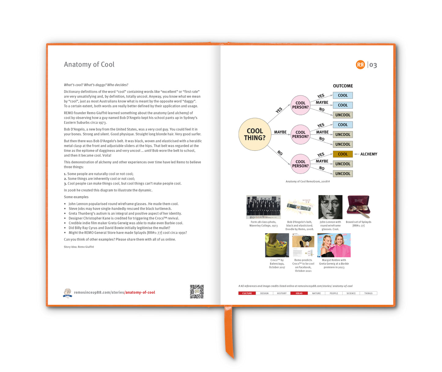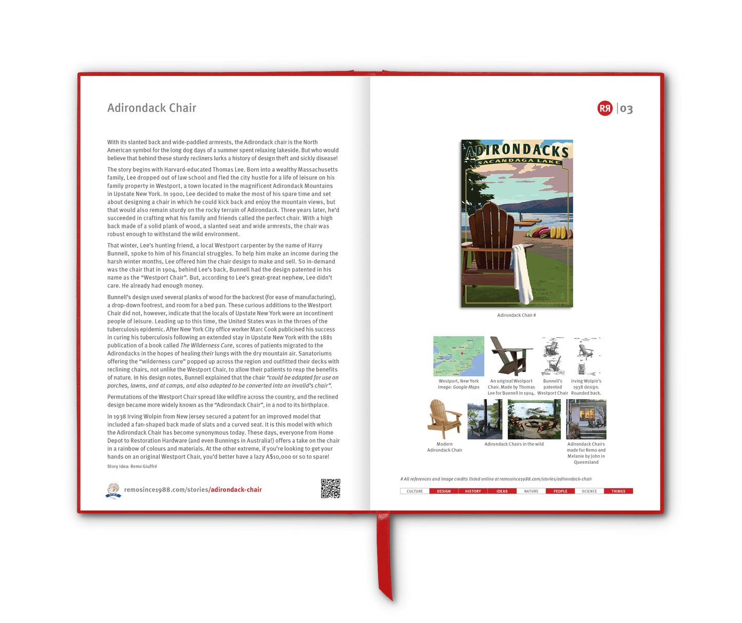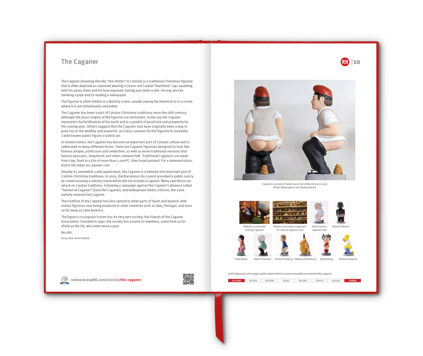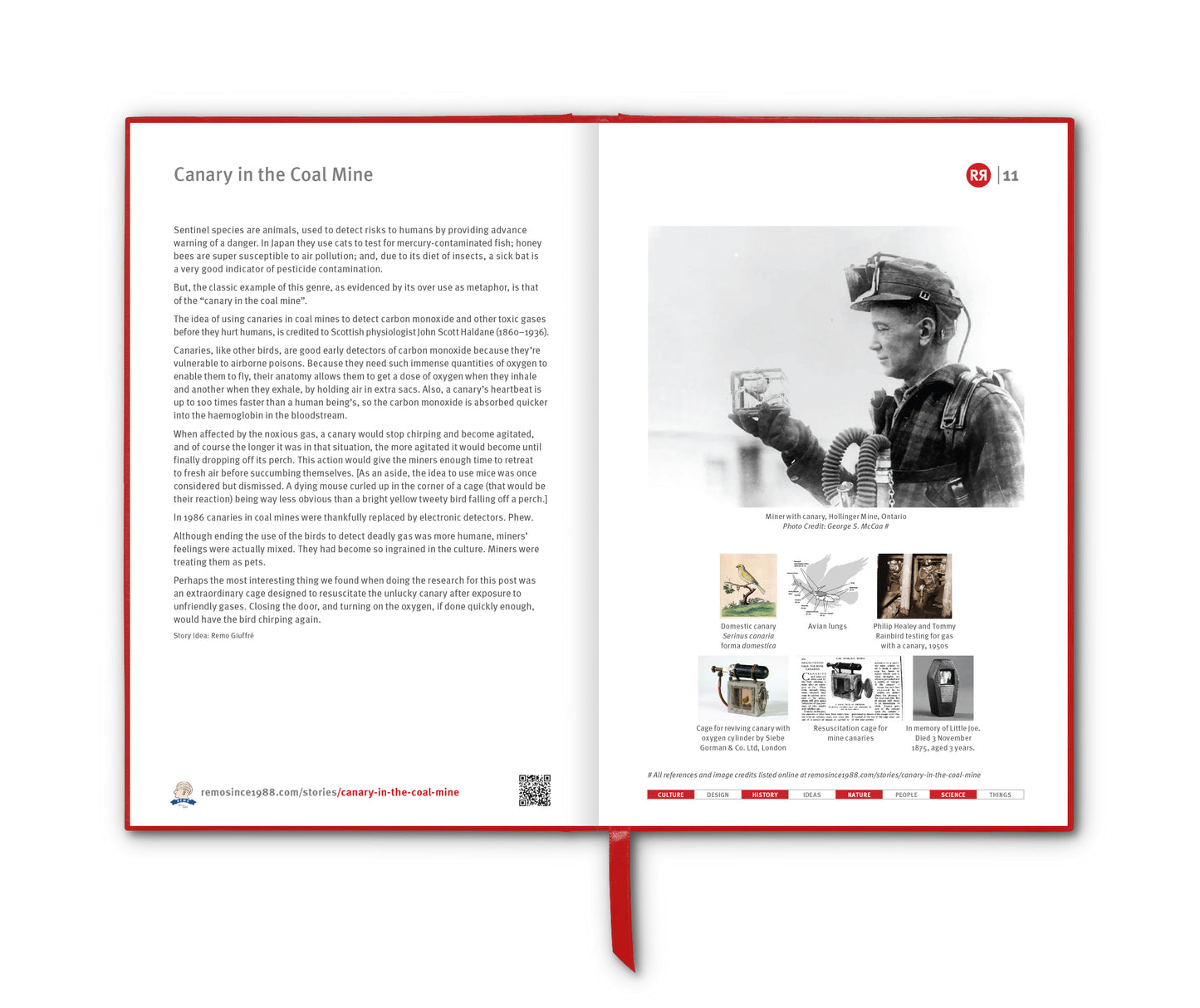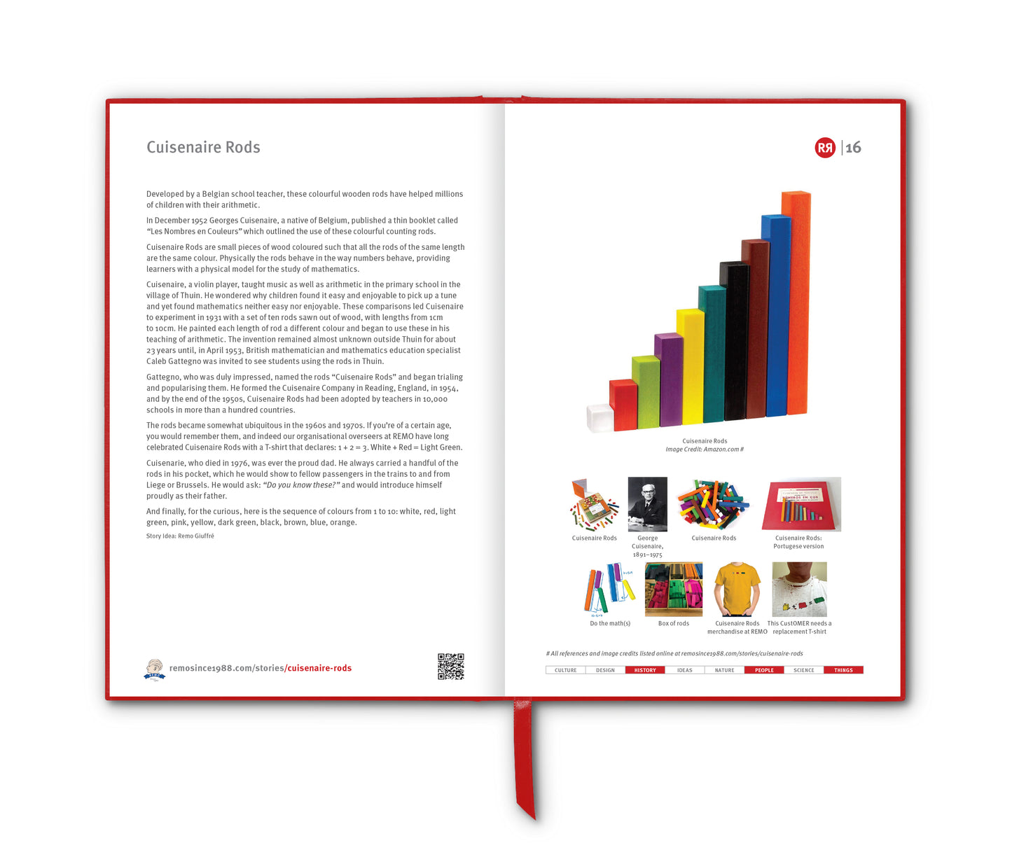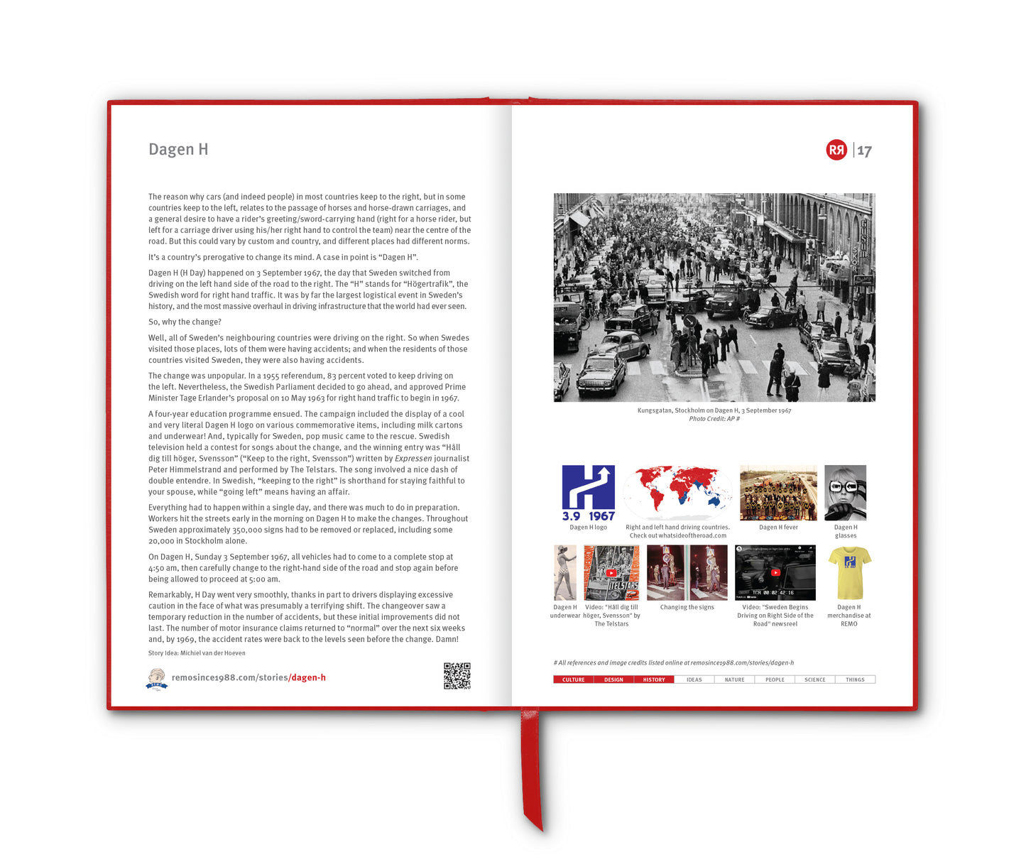

In 1990, a T-shirt design was added to the REMO General Store range that unintentionally demonstrated one of the most famous experiments in the history of cognitive psychology. On the front of the T-short was the word “BLUE” – printed boldly in red ink. On the back: “TRUE” – this time printed in actual blue. A striking combo. Visually arresting. But also, as it turns out, mentally confounding. Not recommended as a gift for the elderly.
True BLUE (as it was named by REMO) is a textbook case of what’s called the “Stroop Effect” – a phenomenon first documented in 1935 by American psychologist John Ridley Stroop. It’s simple on the surface – participants are shown the names of colours (like blue, red, green) printed in mismatched ink colours and asked to say the colour of the ink, not the word itself. When the word “blue” is printed in red, the brain takes a beat longer to respond correctly. It’s not that you don’t know what red looks like. It’s that your brain processes the word faster than the colour, and the two signals collide.
Such interference were explained by the automation of reading, where the mind automatically determines the semantic meaning of the word (it reads the word "red" and thinks of the color "red"), and then must intentionally check itself and identify instead the color of the word (the ink is a color other than red), a process that is not automated.[2]
It’s a tiny but measurable moment of cognitive interference, and it says a lot about how we think. Reading, for most literate adults, is automatic – so much so that even when you’re trying not to read, you kind of do it anyway. Realising that your initial assumption is wrong, and identifying the colour of the word instead is a process that is not automated.
The Stroop test has since become a go-to tool for measuring attention, processing speed and mental flexibility. It’s used in everything from diagnosing neurological disorders to testing how tired someone is.
Similarly, the emotional Stroop test is a psychological variation of the classic Stroop task, designed to reveal how emotionally charged words affect our attention and cognitive processing. Instead of neutral colour words like “blue” or “green,” participants are shown words with emotional significance, such as “death,” “love,” or “failure” – each printed in various ink colours. The task remains the same: name the colour of the ink, not the word itself. But when the word carries emotional weight, people typically take longer to respond, suggesting that emotionally relevant content captures attention and disrupts cognitive control. This delay can reveal unconscious anxieties, trauma, or emotional salience – and is often used in clinical settings to explore conditions like PTSD, depression or anxiety.
What makes the Stroop Effect enduringly interesting is how it taps into the strange friction between intention and automation. And it's not alone. The world is full of everyday Stroop-like stumbles. Two examples:
- The McGurk Effect. Watch a video of someone mouthing “ga”, while the audio says “ba”, and your brain hears “da”. Visual input hijacks auditory perception. What you see changes what you hear.
- Trompe-l'œil street art: A flat pavement painted to look like a deep hole can trigger vertigo. You know it’s flat, but your brain screams otherwise.
These aren't just quirks – they’re glimpses into how the brain prioritises speed over accuracy, habit over analysis, and coherence over contradiction.
The red BLUE front and the blue TRUE back of that REMO T-shirt design make for a poetic little loop. One jangles your brain, the other reassures it. A wearable metaphor for the whole process of perception and truth. What we read isn’t always what we see. What we see isn’t always what’s there. And sometimes, what’s most interesting is the mental stumble itself.
_______________________________
References
wikipedia.org/wiki/Stroop_effect
Images
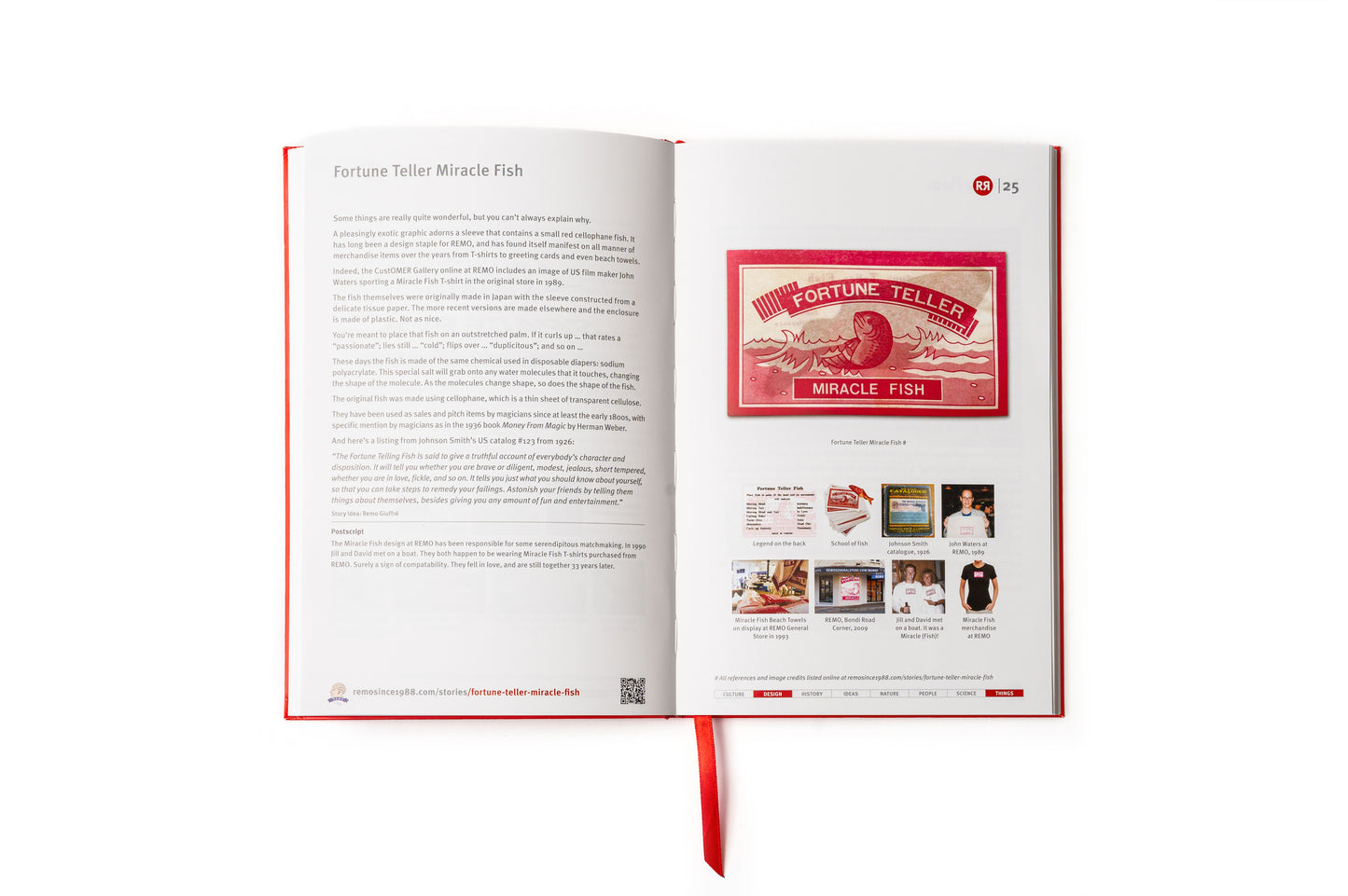
1. True BLUE design at REMO, 1990. Design credit: Remo Giuffré
2. John Ridley Stroop (1921–1968)
3. Stroop stimuli example
4. Anterior cingulate gyrus shows increased activity when viewing conflicting stimulus
5. McGurk Effect
6. Trompe-l'œil pathway
7. True BLUE design at REMO, showing both front and back. Merchandise HERE.