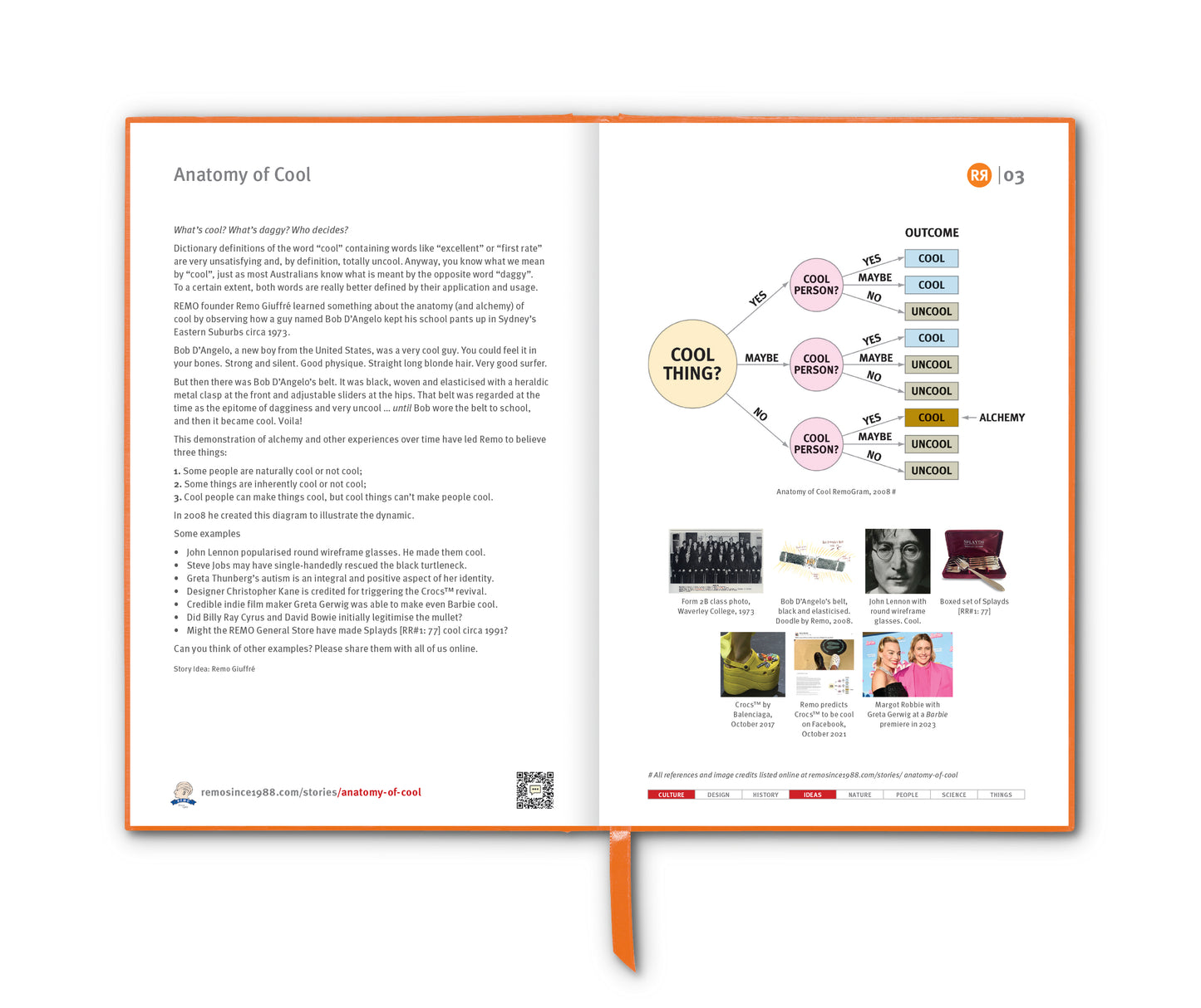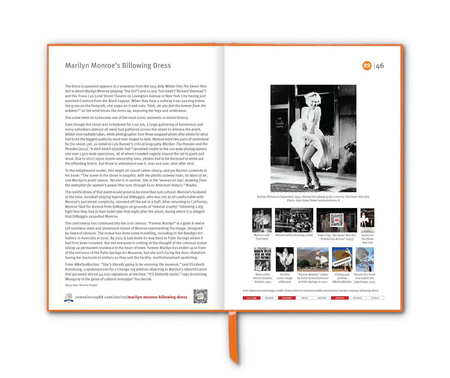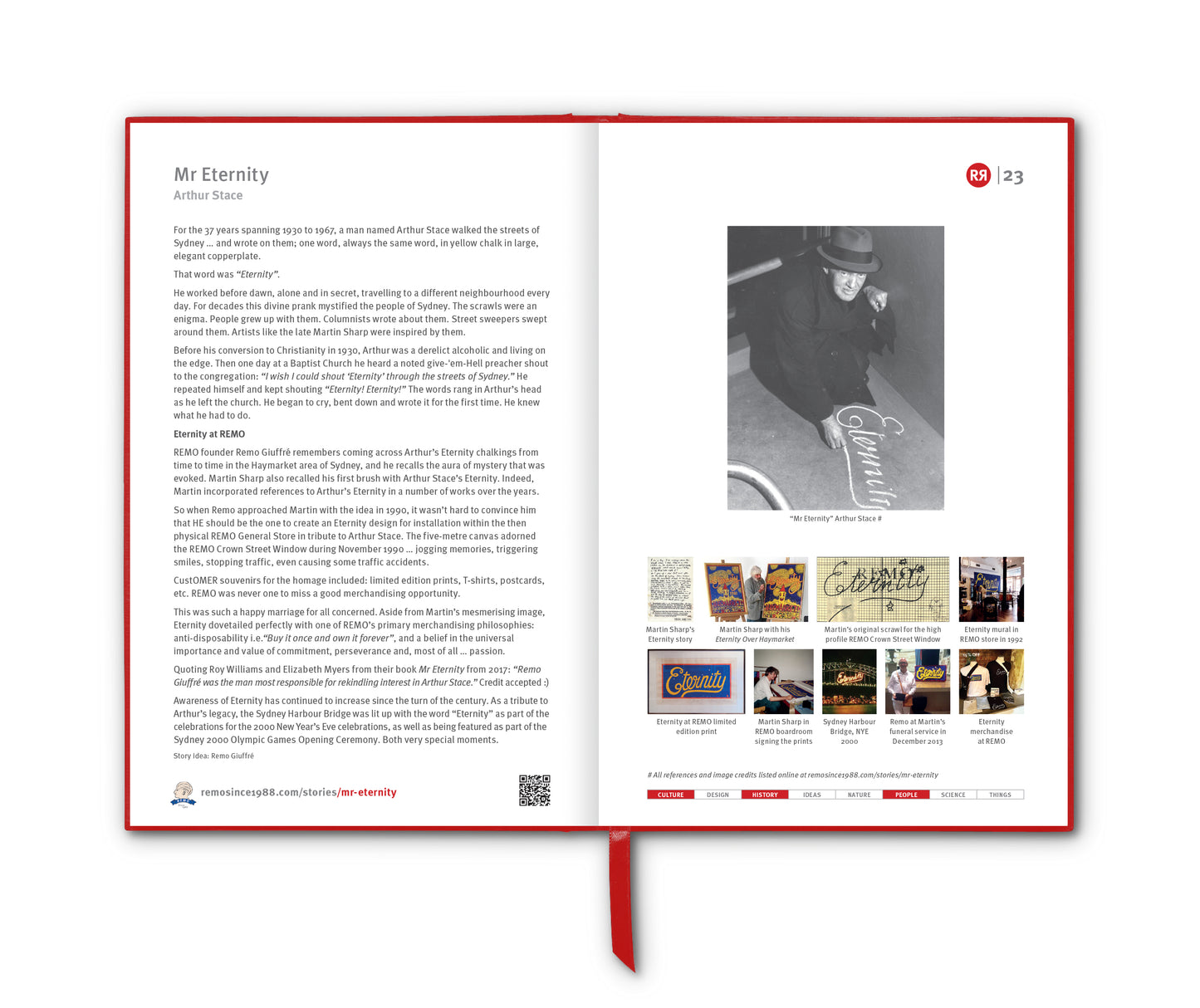

Some colours aren’t just colours. They come with stories, borrow from history and attach to objects or places. We say “red”, but we might actually mean “coquelicot” – the colour of wild French poppies. We say “blue”, but maybe we mean YInMn Blue [RR1:90].
Artists, designers, naturalists and chemists have all contributed to a global lexicon of very particular colour shades. Here’s a selection, including some more contemporary additions where the colour is not just visual – but owned, coded and sometimes even copyrighted.
🔴 Carmine
A deep, warm red originally made from crushed cochineal insects. Once used to dye the robes of cardinals and the uniforms of British soldiers.
🔴 Coquelicot
Bright red-orange, named after the common poppy (Papaver rhoeas) that blankets French countryside fields.
🔴 Puce
A brownish purple or dusty rose, literally French for “flea”. The colour was to resemble old dried bloodstains on linens or bedsheets from crushed fleas or flea droppings.
🩷 Baker-Miller Pink
Also known as “Drunk Tank Pink.” This intense bubblegum colour was used in US correctional facilities in the 1970s after studies claimed it reduced aggression.
🩷 Barbie Pink
Officially Pantone 219 C. A blazing, hyper-feminine fuchsia that’s come full circle – once kitsch, now camp cultural statement.
🩷 Millennial Pink
A dusty, peach-tinted pink that rose to fame in the 2010s. Not quite pastel, not quite salmon. It became the colour of branding, irony and neutral optimism.
🟠 Fulvous
A tawny, dull orange-brown. Used mostly in bird and animal descriptions. Think: owls, ducks and jungle cats.
🟠 Gamboge
A golden yellow-orange pigment derived from tree resin in Southeast Asia. Historically used in Buddhist robes and illuminated manuscripts.
🟡 Chartreuse
Electric yellow-green. Named after a French liqueur made by Carthusian monks. A shade with somewhat of a cult following.
🟡 Naples Yellow
Warm and muted, this pigment was used by Renaissance painters. Made originally from lead antimonate. Now, thankfully, it’s less toxic.
🟡 Safety Yellow
Engineered for maximum visibility, often used in warning signs and industrial design. Not beautiful, but unforgettable.
🟤 UPS Brown
Pantone 462C. The colour of reliability – literally trademarked by United Parcel Service. Not glamorous, but instantly recognisable.
🟢 Celadon
Pale grey-green, the colour of classic Korean and Chinese pottery – serene, watery, timeless.
🟢 Kermit Green
An unofficial but widely recognised bright green, closely associated with this particular Jim Henson Muppet.
🟢 Verdigris
The blue-green crust that forms on oxidised copper (like old coins or the Statue of Liberty). Once used as a pigment despite its instability.
🟢 Viridian
A cool, bluish-green. The name comes from the Latin viridis (green). Popular with Impressionists and modernists alike.
🔵 Cerulean
Sky blue. From the Latin caeruleus, meaning “heavens” or “sky”. Both soothing and strangely expansive. See Cyanometer.
🔵 Tiffany Blue
A custom shade of robin’s egg blue trademarked by Tiffany & Co. since 1845. Technically Pantone 1837 (the year the company was founded). [Ed: Now, that's a fun fact.]
🔵 YInMn Blue
Discovered in 2009 at Oregon State University, this vibrant blue is heat-resistant, UV-stable and unusually bright. A modern classic born in a chemistry lab. See [RR1:90].
🔵 Zaffre
A deep blue made by roasting cobalt ore. Used in 18th-century glassmaking and Victorian ceramics.
🟣 Mauve
Discovered accidentally in 1856 by an 18-year-old chemist, it was the world’s first synthetic dye. A dusty purple that launched the modern dye industry. See [RR3:66].
🟣 Tyrian Purple
The legendary purple of ancient royalty, extracted from murex sea snails in Phoenicia. Labour-intensive and wildly expensive – worth more than gold in its day.
⚫ Greige
A modern mash-up of grey and beige. Subtle, sophisticated, and heavily used in fashion and interiors.
⚫ Vantablack
One of the darkest substances ever created, it absorbs 99.96% of visible light. Technically not a pigment, but a nano-material.
⚪ Ivory Tower White
Used by Apple in design briefings to describe an ideal, pristine off-white tone. Often mimicked in digital product design for a sterile but soft effect.
__________________________
References
ChatGPT by OpenAI
goalcast.com/sexy-and-twisted-story-of-the-color-puce
underthemoonlight.ca/2020/07/14/puce-was-once-popular-in-16th-century-france
Images
1. Puce is a brownish purple or dusty rose, literally French for “flea”. Illustration of a flea by Robert Hooke.
2. Coquelicot red-orange poppies (Papaver rhoeas)
3. Millennials in pink
4. Chartreuse. Photo credit: chartreuse.fr
5. Kermit the frog is Kermit green
6. The Statue of Liberty is, by definition, verdigris green.
7. Tiffany blue
8. YInMn Blue [RR1:90]
9. Perkin Mauve dyed swatch of silk, 1860
10. Vantablack BMW, 2019. Photo credit: bmw.com