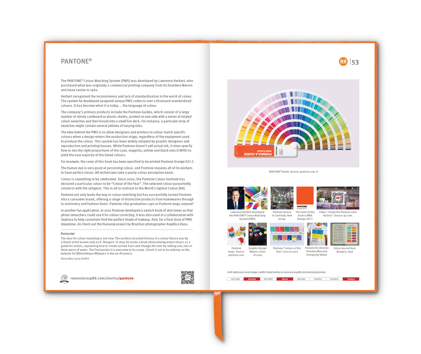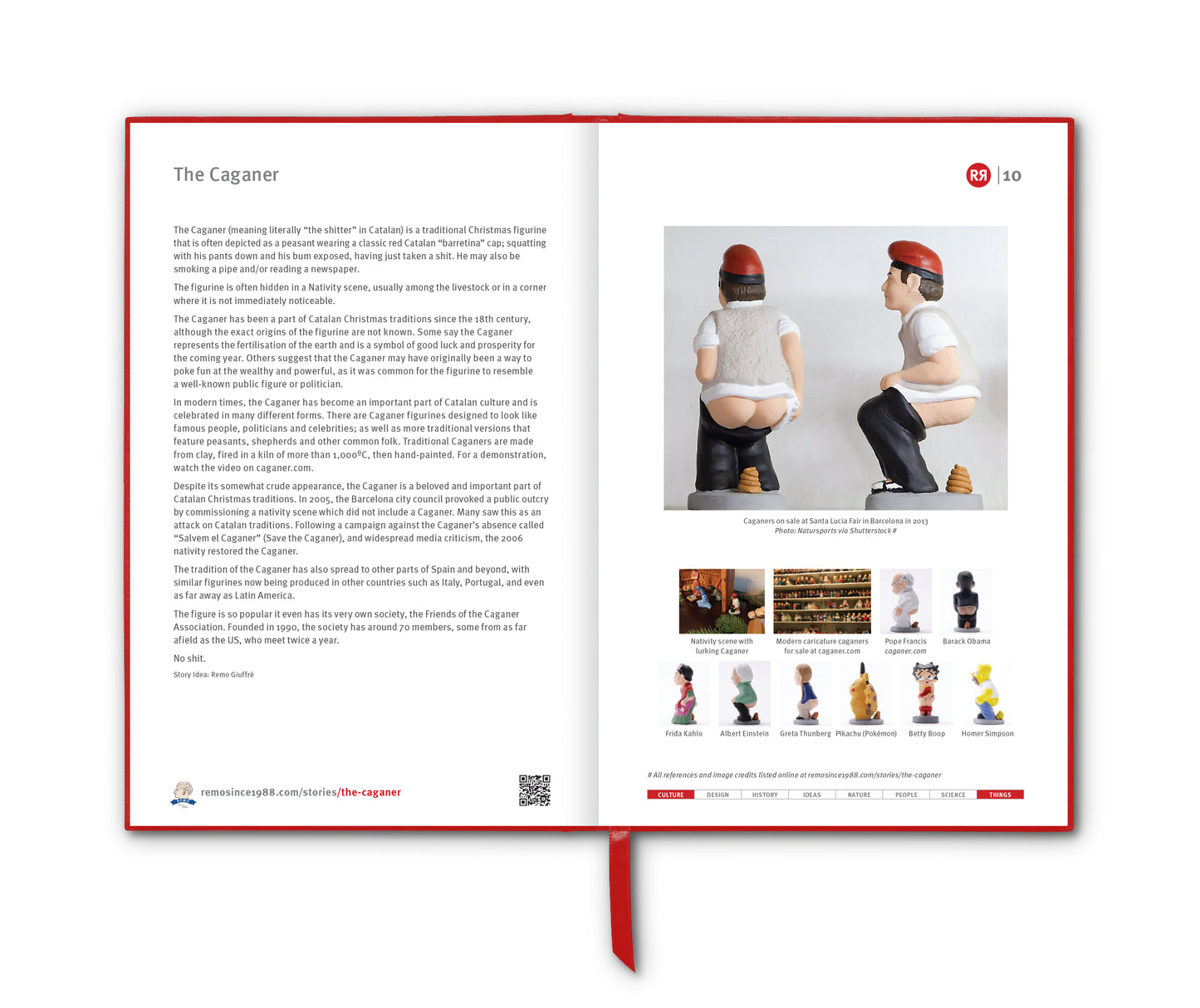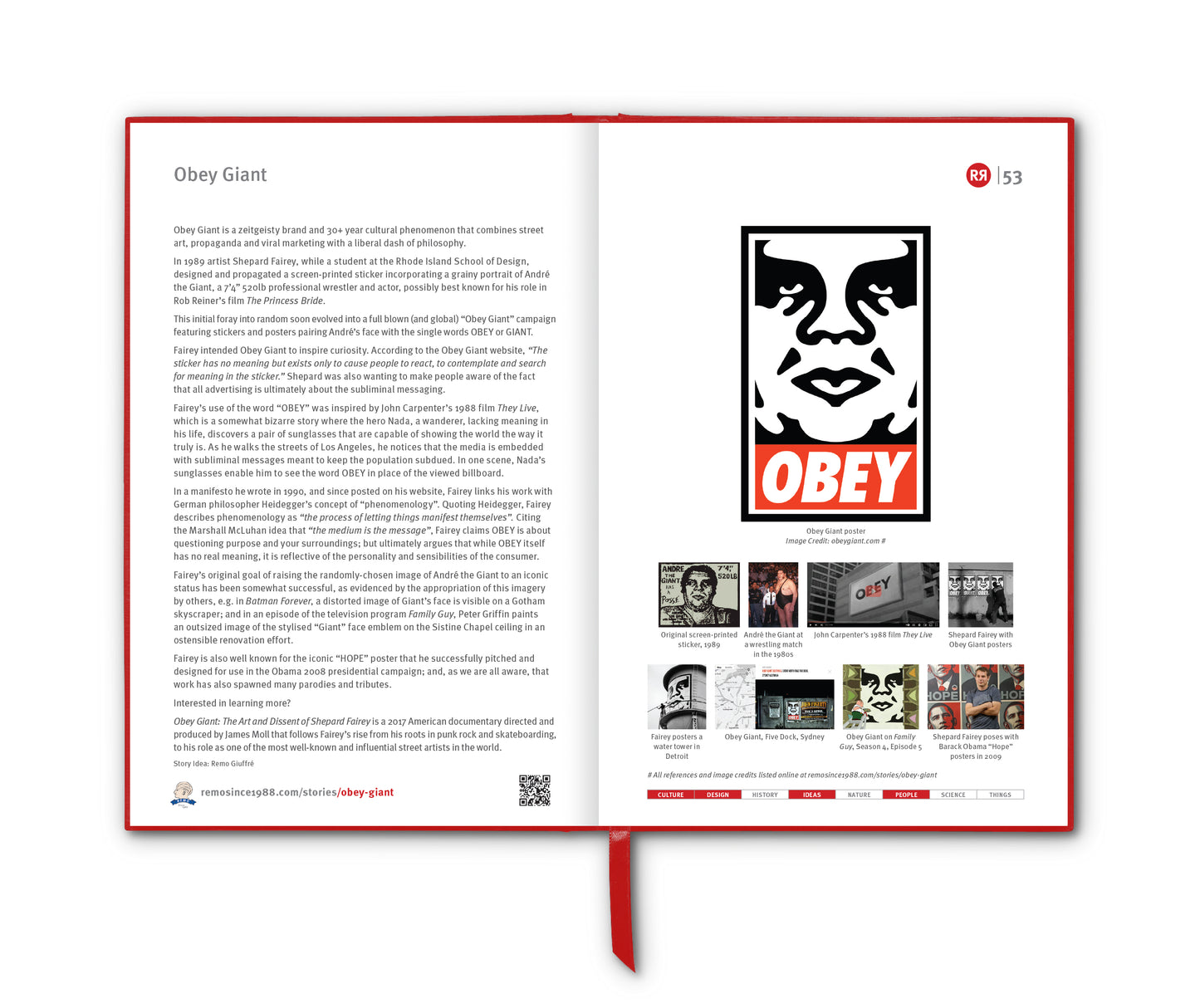

"I ♥ NY" is an iconic slogan and logo that has become synonymous with New York City. Designed by Milton Glaser in 1977, the logo was part of an advertising campaign commissioned by the New York State Department of Economic Development to boost tourism during a particularly challenging economic period.
Just a couple of years earlier President Gerald Ford gave a speech denying federal assistance to spare New York from bankruptcy. The front page of The Daily News the next day read: “FORD TO CITY: DROP DEAD”. Ford never explicitly said “drop dead”. Yet those two words, arguably the essence of his remarks as encapsulated in the immortal headline, would, as he later acknowledged, cost him the presidency the following year, after Jimmy Carter, nominated by the Democrats in New York, narrowly carried the state. But we digress …
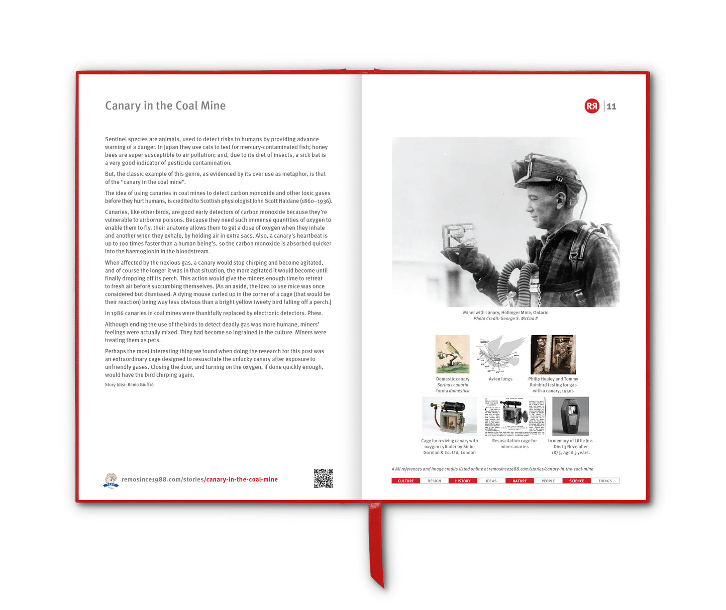
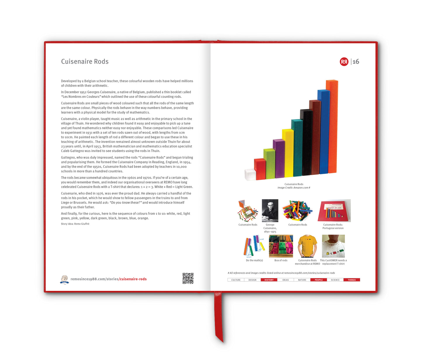
The Glaser logo features the letter "I" followed by a red heart symbol, then the letters "NY”, all set in a rounded serif typeface called “American Typewriter”. This simple yet powerful design, using the heart symbol as a logograph for the English verb "to love" for the very first time, quickly gained immense popularity and has since become one of the most recognised and imitated logos in the world.
Glaser's original (and donated) design was sketched in red crayon on a scrap of paper while riding in the back of a taxi. The original doodle is held in the Museum of Modern Art in Manhattan.
As the idea developed, Glaser decided to stack the I and the heart shape on a line above the NY characters, later stating that he may have been "subliminally" influenced by Robert Indiana's pop art LOVE image.
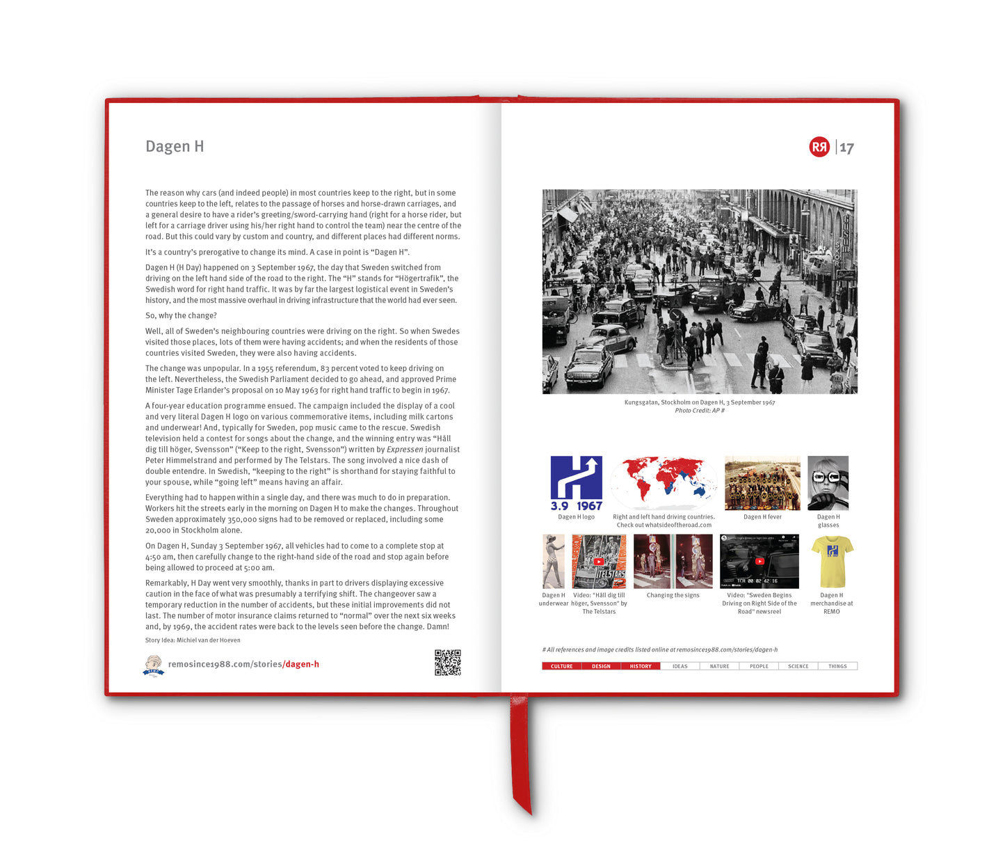
The I ♥ NY success was immediate and overwhelming. It not only helped revitalise the city's image but also became a cultural symbol representing the vibrancy, resilience and diversity of New York. Over the years, I ♥ NY has been adapted and parodied in numerous ways, but the original logo remains a beloved emblem of the city, appearing on countless souvenirs, including T-shirts, mugs and posters … and continues to be a popular motif among tourists and locals alike.
The image became especially prominent following the September 11 attacks on the city, which created a sense of unity among the populace. Glaser created a modified version to commemorate the attacks, reading "I ♥ NY More Than Ever", with a little black spot on the heart symbolising the World Trade Center site.
Finally, in the wake of the COVID-19 epidemic, the New York State Department of Economic Development tried its luck again with a new version: WE ❤️ NYC. It was a flop. Adam Gopnick, writing in The New Yorker on 23 March 2023 lays part of the blame on those three letters, NYC:
“NYC, though an abbreviation used in official records and sometimes on mail, is unnatural to New Yorkers and calls up no sensitive synecdochic vibrations. We know New York only as New York—the state comes in a sad second in the registry of meaning. “NYC” is like “Avenue of the Americas”—a rebrand used only by out-of-towners. “NYC” is going a bridge, or consonant, too far.”
________________________
References
https://en.wikipedia.org/wiki/I_Love_New_York
https://www.latimes.com/entertainment-arts/story/2020-06-27/appreciation-how-milton-glasers-i-p-10084-65039-p-ny-logo-taught-us-to-talk-in-emoji
https://www.newyorker.com/culture/cultural-comment/the-we-heart-nyc-logo-flop
Images
1. I ♥ NY. Credit: New York State Department of Economic Development.
2. Milton Glaser (1929–2020)
3. The Daily News front page, 30 October 1975
4. Red crayon concept sketch of the Glazer's idea, 1976
5. LOVE image, Robert Indiana, 1964
6. This Banksy mural brings Glaser’s design to a larger scale
7. Actor Robin Williams wearing a T-shirt with the logo translated into Arabic in 2003
8. After the 9/11 attacks, Glaser updated the logo with a bruised heart
9. WE ❤️ NYC. Credit: New York State Department of Economic Development.