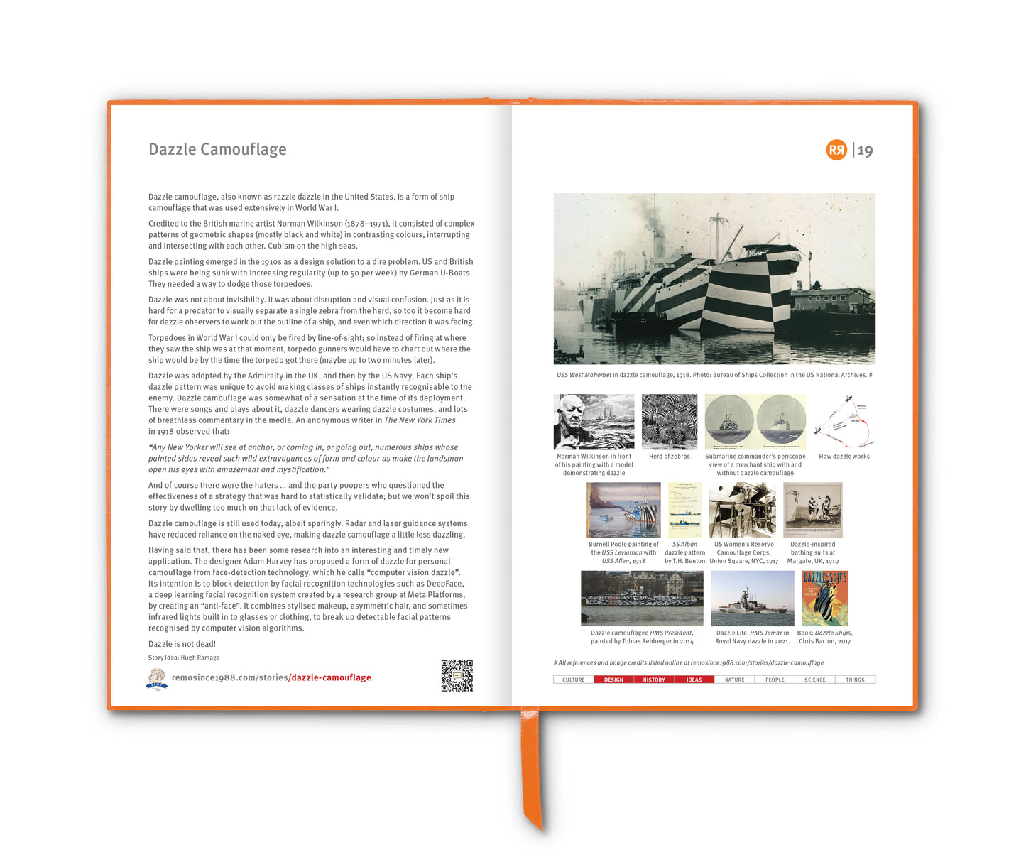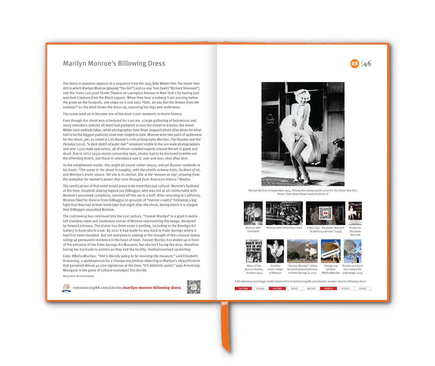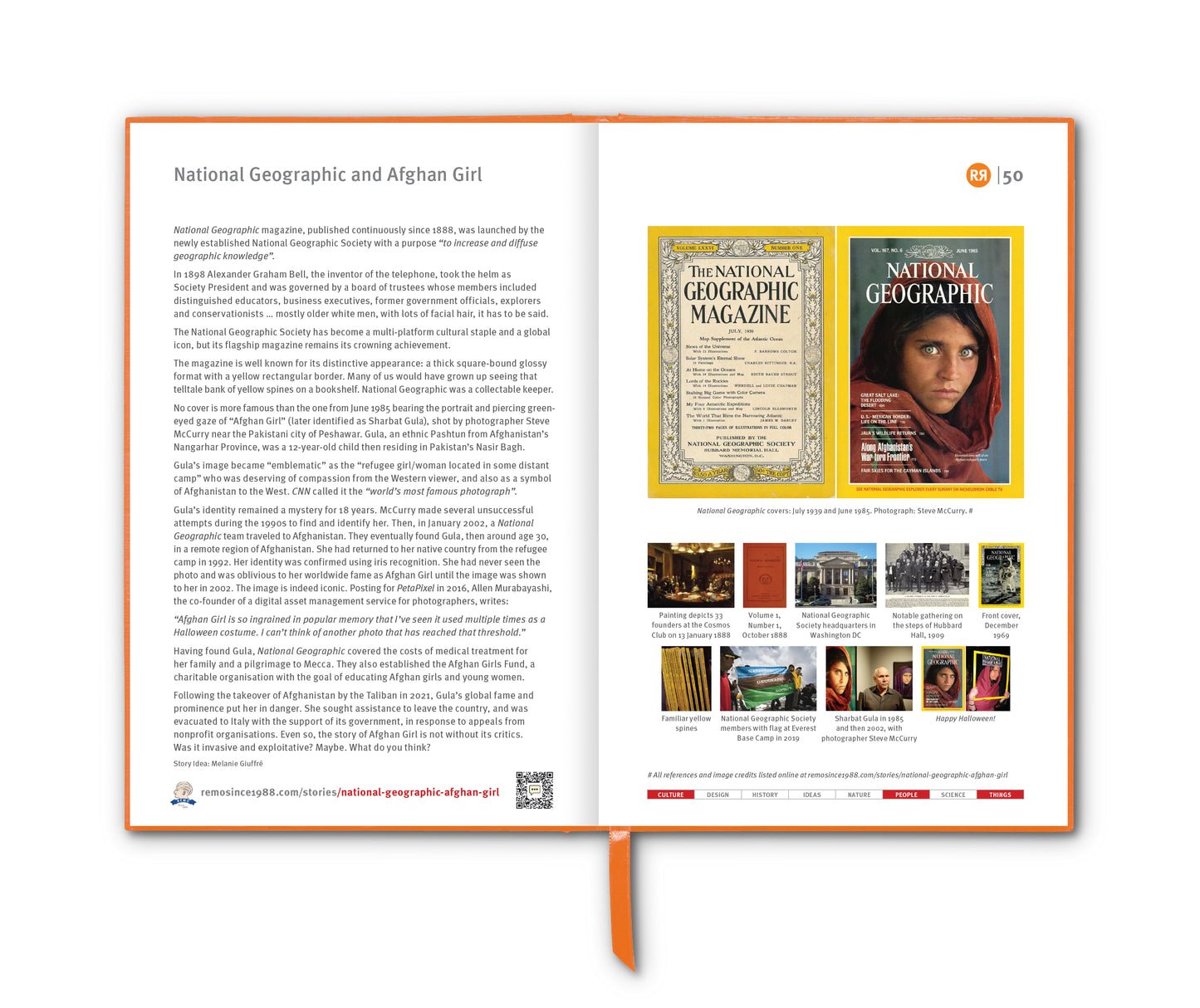

The PANTONE® Colour Matching System (PMS) was developed by Lawrence Herbert, who purchased what was originally a commercial printing company from its founders Mervin and Jesse Levine in 1962.
Herbert recognised the inconsistency and lack of standardisation in the world of colour. The system he developed assigned unique PMS codes to over a thousand standardised colours. It has become what it is today … the language of colour.
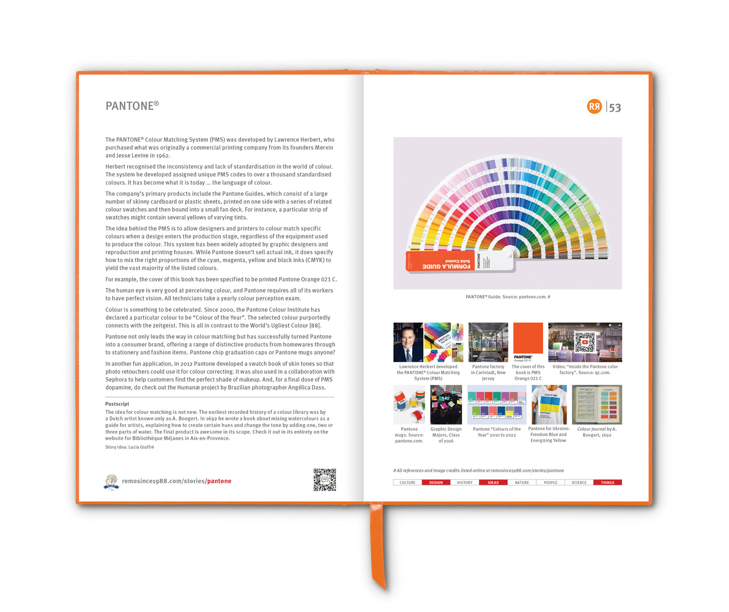
The company's primary products include the Pantone Guides, which consist of a large number of skinny cardboard or plastic sheets, printed on one side with a series of related colour swatches and then bound into a small "fan deck". For instance, a particular "page" might contain several yellows of varying tints.
The idea behind the PMS is to allow designers to "colour match" specific colours when a design enters the production stage, regardless of the equipment used to produce the colour. This system has been widely adopted by graphic designers and reproduction and printing houses. While Pantone doesn’t sell actual ink, it does specify how to mix the right proportions of the cyan, magenta, yellow and black inks (CMYK) to yield the vast majority of the listed colours.
For example, this story will be printed in a book with the cover colour specified to be Pantone Orange 021, equivalent to CMYK percentages respectively of: 0%, 65%, 100%, 0%. This specification will enable a book printer in China to mix either just the right spot colour, or layers of ink … for application onto the cover, thereby satisfying the very particular REMORANDOM designers here in Sydney.
The human eye is very good at perceiving colour, and Pantone requires all of its workers to have perfect vision. All technicians take a yearly colour perception exam. Watch a lovely video tour of the Pantone factory in Carlstadt, New Jersey HERE.
Colour is something to be celebrated. Since 2000, the “Pantone Colour Institute” has declared a particular colour to be "Colour of the Year". The selected colour purportedly connects with the zeitgeist. [Ed: I wonder if they’ll ever pick poo brown.]
Pantone not only leads the way in colour matching but has successfully turned Pantone into a consumer brand, offering a range of distinctive products from homewares through to stationery and fashion items. Pantone mugs anyone? The elaborate web of products represents the company’s strategic quest to become the universal language of colour, and a brand synonymous with good design e.g. a trend that Pantone really loves is the one where students decorate their graduation caps with Pantone imagery; evidence that a fundamentally offline brand can still be cool with the kids.
In another fun application, in 2012, Pantone developed a swatch book of skin tones so that photo retouchers could use it for colour correcting. It was also used in a collaboration with Sephora to help customers find the perfect shade of makeup. And, for a final dose of PMS dopamine, do check out the Humanæ project by Brazilian photographer Angélica Dass.
Story Idea: Remo Giuffré
Postscript
The idea for colour matching is not new. The earliest recorded history of a colour library was by a Dutch artist known only as “A. Boogert". In 1692 he wrote a book about mixing watercolours as a guide for artists, explaining how to create certain hues and change the tone by adding one, two or three parts of water. The final product is awesome in its scope. Check it out in its entirety on the website for Bibliothèque Méjanes in Aix-en-Provence HERE.
_____________________
References
wikipedia.org/wiki/Pantone
aprcreative.com.au/the-history-of-pantone
fastcompany.com/3050240/how-pantone-became-the-definitive-language-of-color
marketing-interactive.com/pantone-ukraine-blue-yellow
setaprint.net/2016/02/inside-the-pantone-color-factory
Images
1. PANTONE® Guide. Source: pantone.com
2. Lawrence Herbert
3. Pantone factory in Carlstadt, New Jersey
4. PMS Orange 021 C
5. Video: Inside the Pantone colour factory. Source: qz.com
6. Pantone mugs. Source: pantone.com
7. Graphic Design Majors at Nazareth College's class of 2016 graduation wearing their Pantone colour graduation caps
8. Pantone "Colours of the Year" 2010 to 2022
9. Pantone for Ukraine. T-shirt via molodec.com.ua. Freedom Blue and Energizing Yellow
10. Colour journal by A. Boogert, 1692. Browse in full HERE.