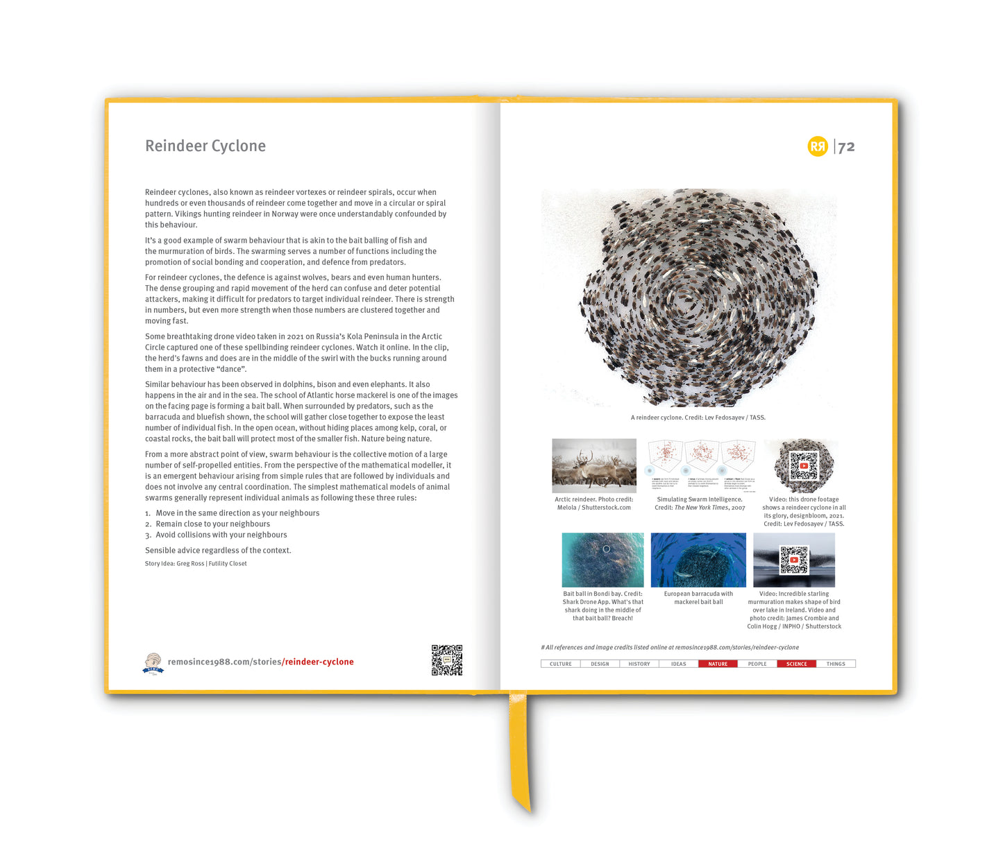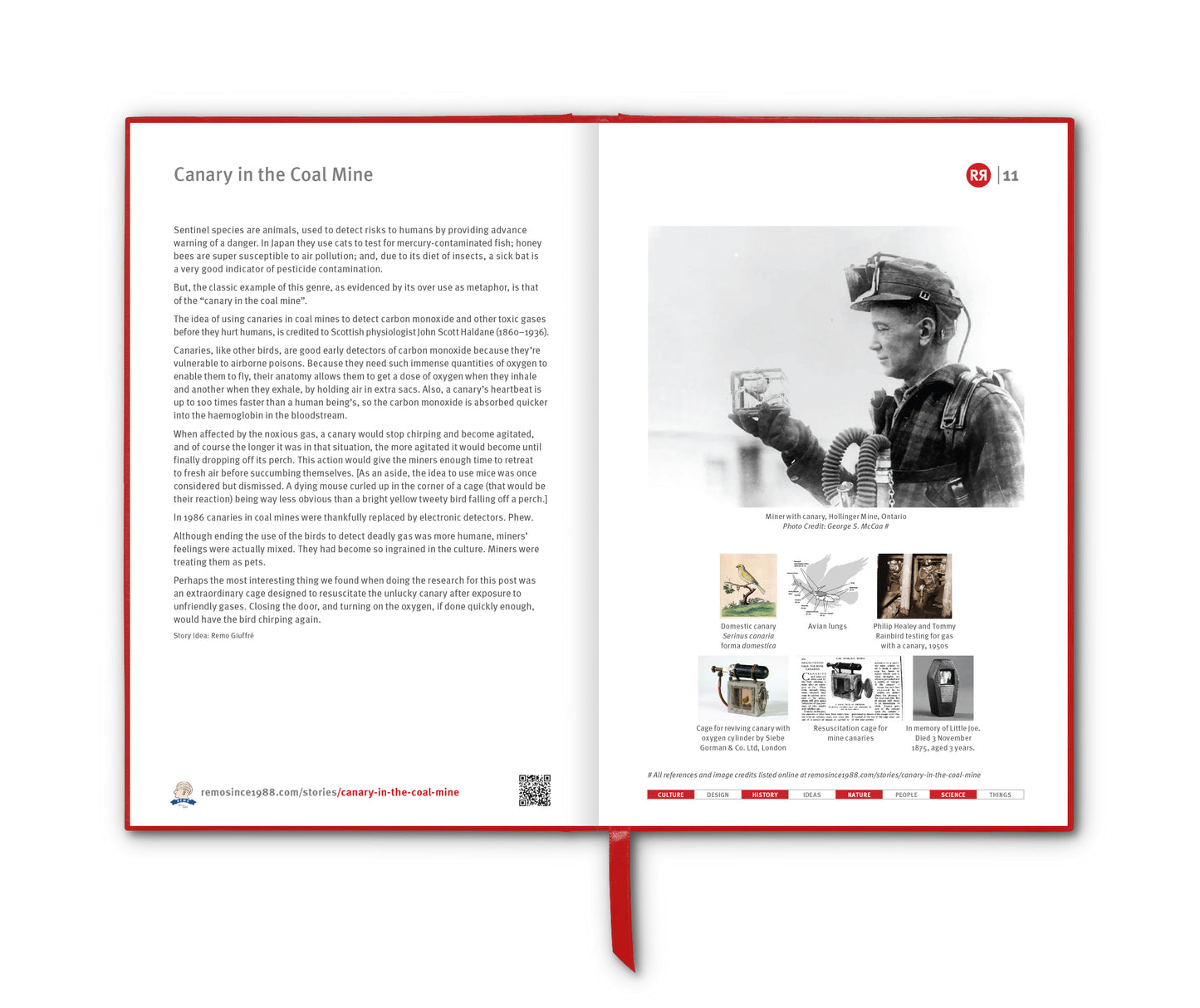

There are few objects in the built environment as instantly recognisable — and as universally obeyed — as the STOP sign. But while it may seem like an eternal fixture of road life, the STOP sign is rather the result of evolving design, advancing materials, and a thoughtful approach to human psychology.
The very first STOP sign appeared in Detroit in 1914, just as automobiles began to take over city streets. It was a far cry from the bold red octagon we know today. That original sign was black text on a white background, modest in size, and generic in shape — one of many early traffic experiments in a time when horses and cars still shared the roads.
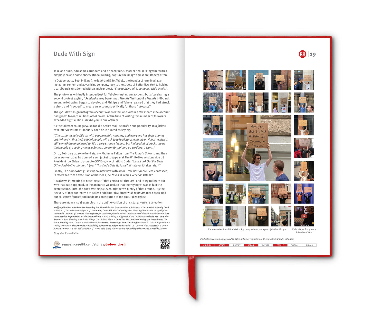
In the 1920s, engineers began looking for a more universal system of signage. Colour was a key part of this. Red was naturally associated with danger and stopping, thanks in part to its use in railway signals and its strong visual impact. However, early red pigments and dyes weren’t durable enough to withstand sun and rain. Instead, yellow with black text became the standard for STOP signs in many places — visible, practical and resistant to fading.
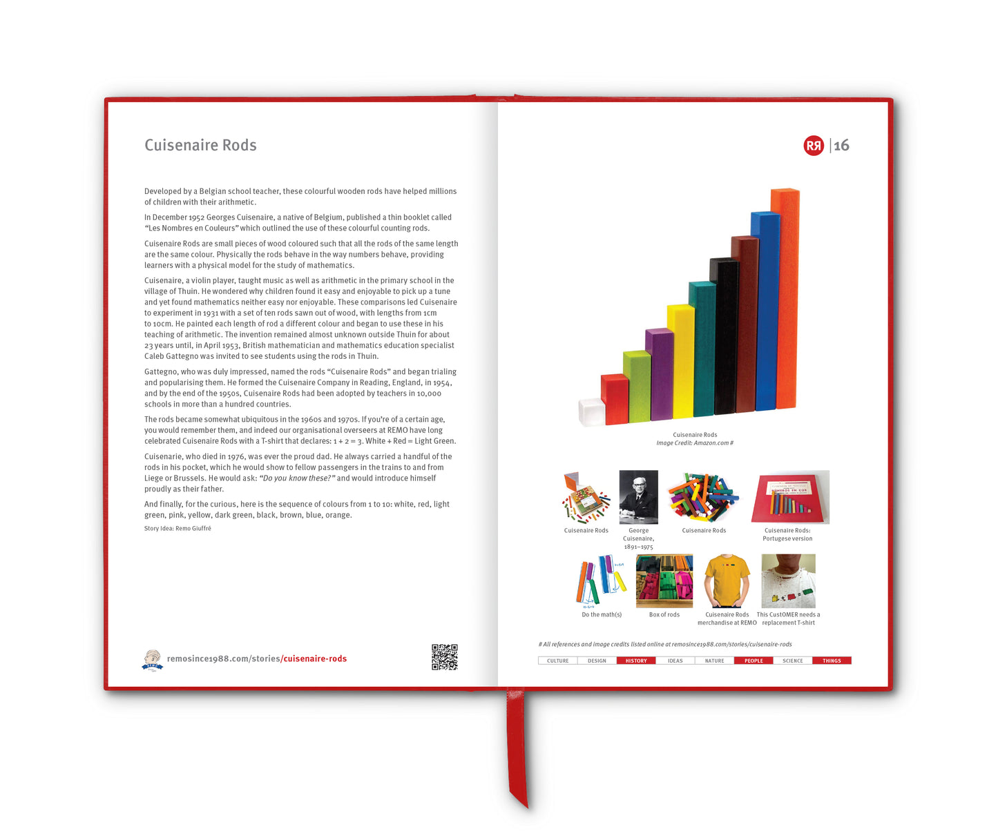
It wasn’t until 1954 that the now-familiar white-on-red STOP sign became official in the United States. By then, enamel coatings and reflective materials had improved enough to make red both bold and long-lasting. The US Manual on Uniform Traffic Control Devices (MUTCD) declared the red octagon the standard, and it gradually spread internationally. Today, even countries that write “STOP” in their own languages often retain the red octagon, making it a cross-cultural symbol of caution. (If you ever spot a blue STOP sign, it means that it's not an official STOP sign, and is likely being used on private property.)
And what about that distinctive octagonal shape? There’s logic in that too. In the 1920s, traffic engineers developed a kind of shape hierarchy to indicate the severity of road warnings:
- Circle: the most urgent (used for railroad crossings),
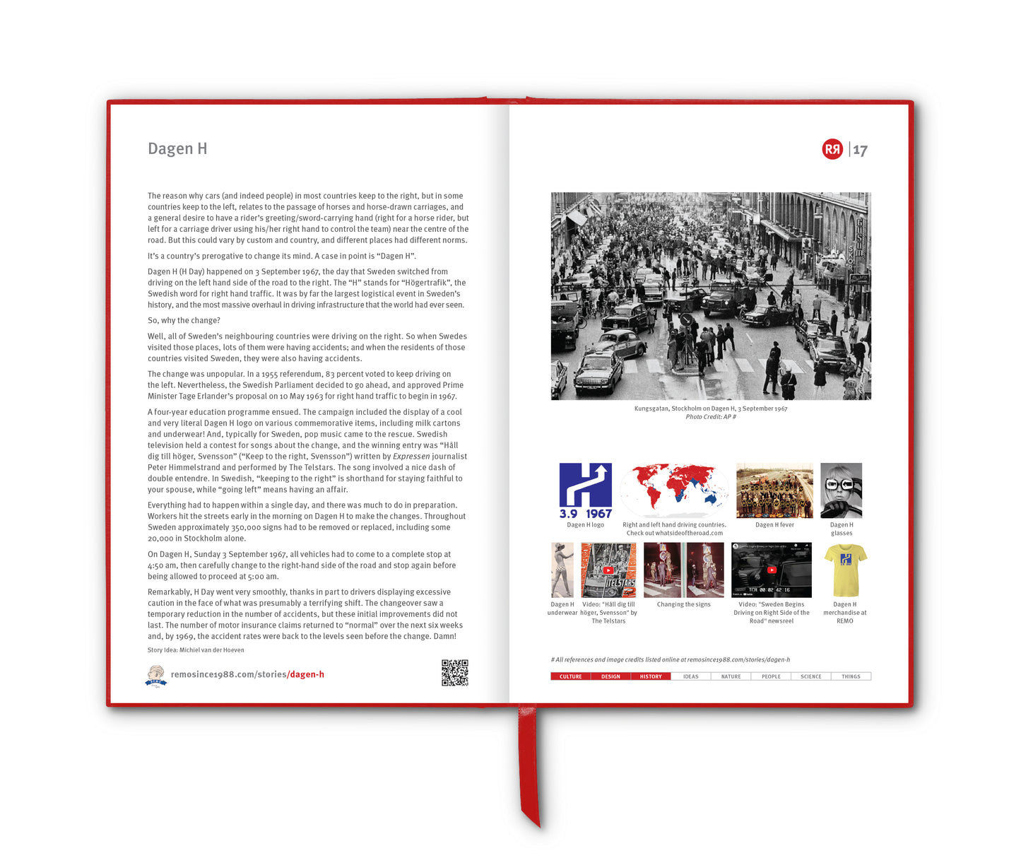
- Octagon: next in line (STOP),
- Diamond: for general warnings, and
- Rectangle: for informational signs.
The beauty of the octagon is that it’s recognisable from both front and back. So even if you approach an intersection and see only the back of a sign, the shape instantly tells you what kind of regulation applies – a crucial cue in low-light or high-speed situations.
Over the years, the STOP sign has become more than just a traffic control device. It's found its way into pop art, protest signage and design catalogs.
And finally a twist to leave you with: Back in 2003 the REMO store was happily promoting and selling Stop! In the Name of Love … a delightfully Stroop’esque work by artist Alan James. Today, according to Alan’s website, there are more than 450 "Love Signs" out there in the world – hanging out in bedrooms and boardrooms from Noosa to New York, Paddington to Paris. [Ed: And there’s a couple here in North Bondi] – not to mention the version that Alan was kind enough to customise for REMO ;)
_______________________
References
wikipedia.org/wiki/Stop_sign
99percentinvisible.org/article/red-white-sometimes-blue-how-safety-shaped-the-octagonal-stop-sign
aletal.com.au/work/text-art
lovesign.com.au/love-sign-story
Images
1. STOP sign. Photo by Joshua Hoehne on Unsplash
2. Original yellow STOP sign
3. Private bue STOP sign
4. Irish STOP sign
5. Monterrey, Mexico. Photo credit: Aldo Dávalos
6. Thailand
7. China
8. Palestine and Israel
9. South Korea
10. Stop! In the Name of Love … Alan James, 2003
11. Stop in the name of REMO, special Alan James version, 2004