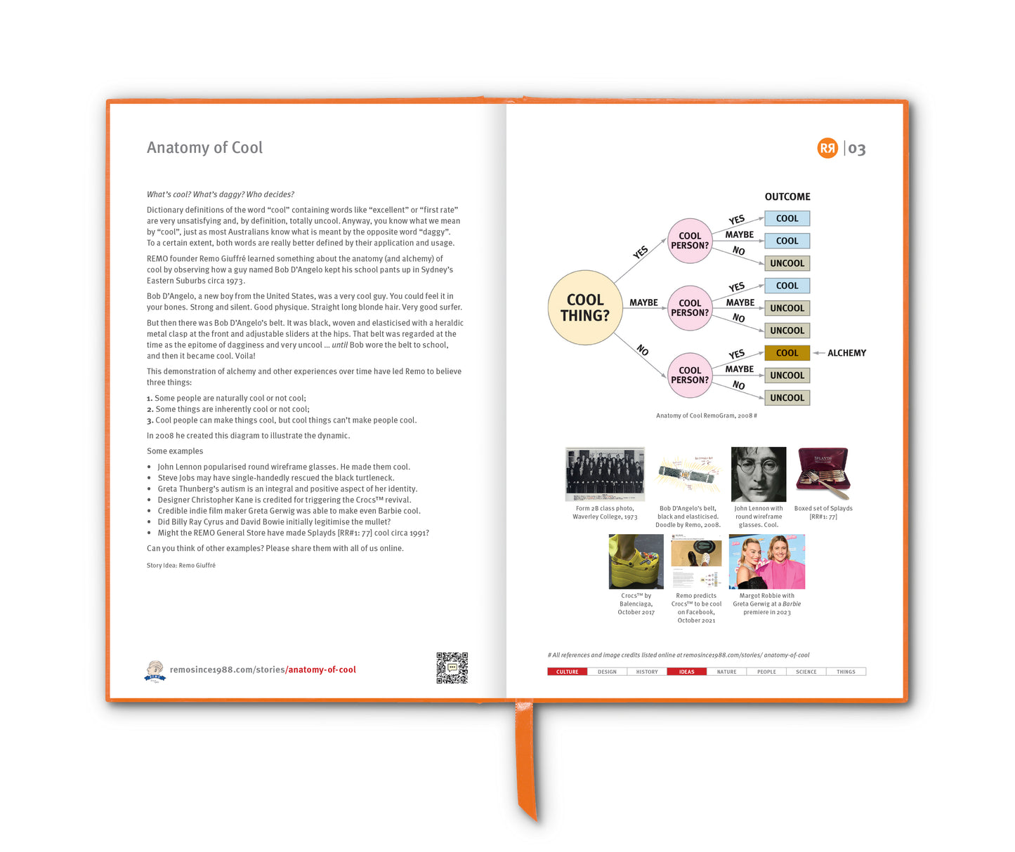

Is PANTONE® 448 C really the world’s ugliest colour?
According to an advisory team of academics and market researchers that came up with the design for the Australian Government’s plain cigarette packets, it’s certainly the least appealing.
Australia was actually the first country in the world to introduce plain tobacco packaging, with all packets sold from 1 December 2012 being sold in logo-free, "drab dark brown" packaging. There has been opposition from tobacco companies to plain packaging laws, some of which have sued the Australian Government in Australian and international courts. Since the Australian Government won those court cases, several other countries have enacted plain packaging laws, e.g. France (January 2017); the United Kingdom (May 2017), New Zealand (June 2018) … and, more recently, The Netherlands (October 2021).
Anyway, back to the colour of the packaging. Via a process of seven studies, involving more than 1000 regular smokers, aged 16 to 64, participants in a 2011 study by research agency GfK Blue Moon, indicated that what the drab dark brown packages had the lowest overall appeal and looked like they would contain the lowest quality cigarettes, which would cause the most harm. Other colours considered were lime green, white, beige, dark grey and mustard. But none came close to PANTONE 448 C in terms of its ability to “minimise appeal” and “maximise perceived harm”.
“It had as its aim the antithesis of what is our usual objective”, says market researcher Victoria Parr, who headed the project. “We didn’t want to create attractive, aspirational packaging designed to win customers ... Instead our role was to help our client reduce demand, with the ultimate aim to minimise use of the product.”
Plain old dark brown came close, but was ultimately ruled out because it was perceived by some as “rich” and “upmarket”; so too, medium olive which was later discarded because it was likened to “gold” and therefore seen as “classy”.
Pantone 448C “was commonly described as ‘death’, ‘dirty’ or ‘tar’ without any positive adjectives", says Ms Parr.
The federal government initially referred to the murky hue as “olive green”. That was until the Australian Olive Association wrote to the Health Minister at the time, Nicola Roxon, urging her to stop using the term because it was denigrating the olive brand.
Story Idea: Greg Ross, Futility Closet
____________________________________
References
smh.com.au/national/does-this-colour-turn-you-off
futilitycloset.com/2023/12/04/brown-study
time.com/4353765/worlds-ugliest-color-discourages-smoking
Images
1 & 2. PANTONE® 448 C. Learn all about PANTONE HERE.
3. GfK Blue Moon: Market Research to Determine Effective Plain Packaging of Tobacco Products, August 2011, Page 90. Full report HERE.
4. UK Government standardised pack design mock up
5. Olives: "Keep my Name Out of your Sm***kin' Mouth!"