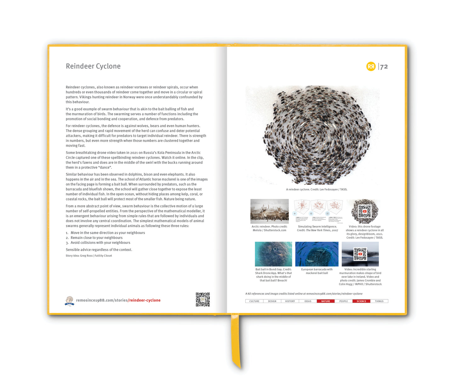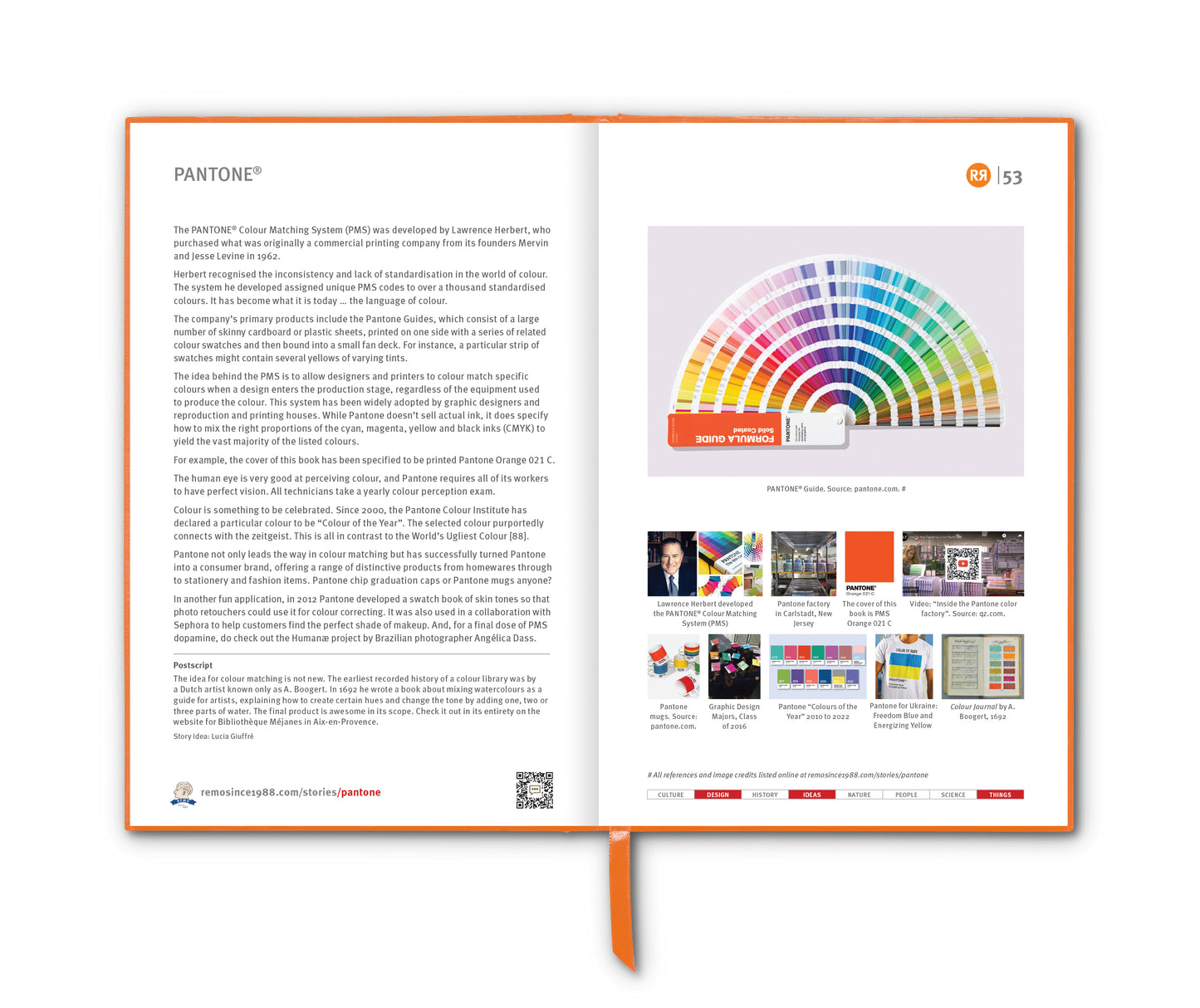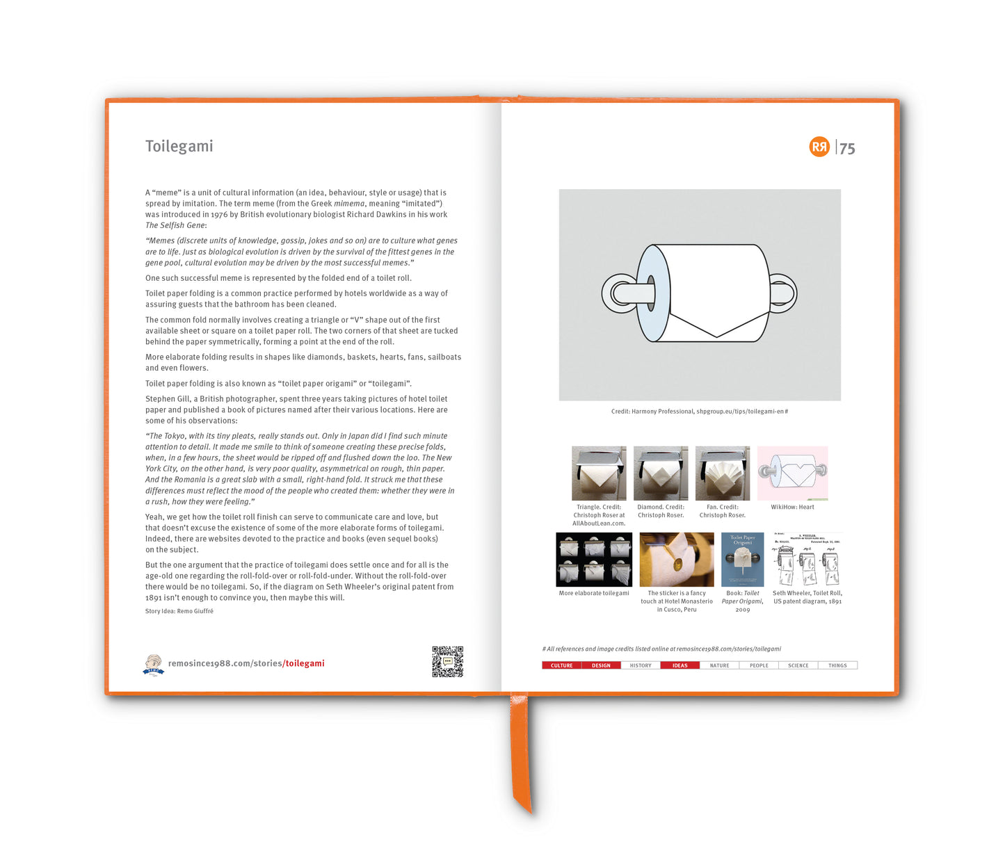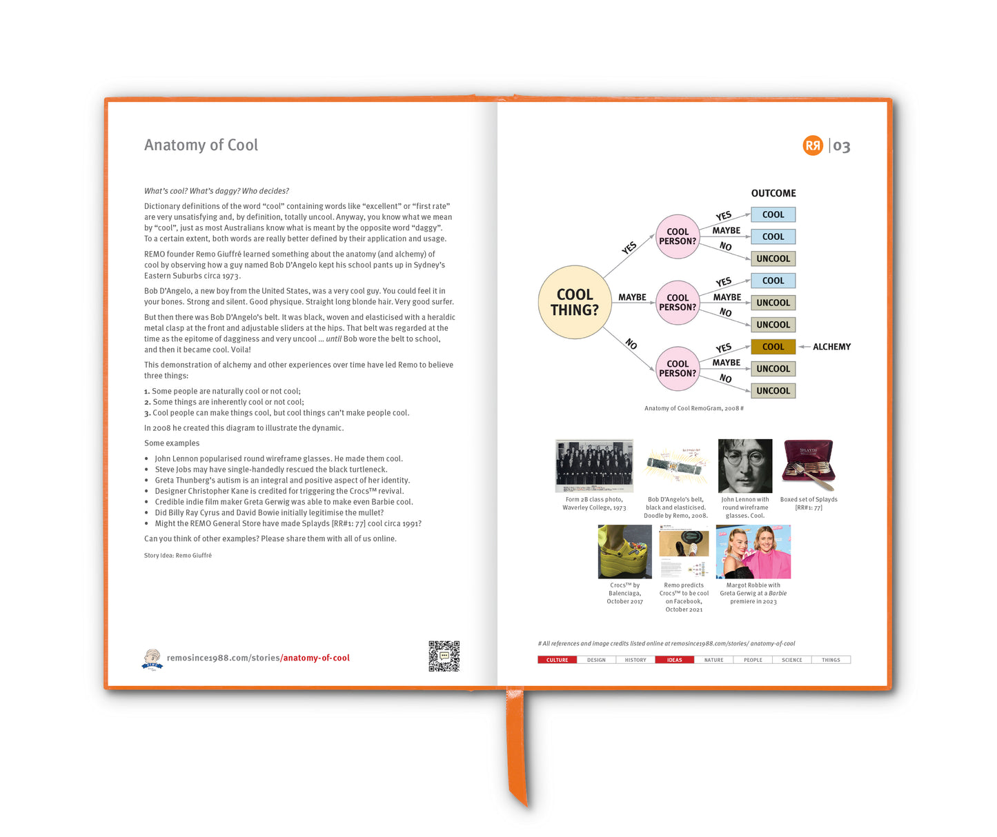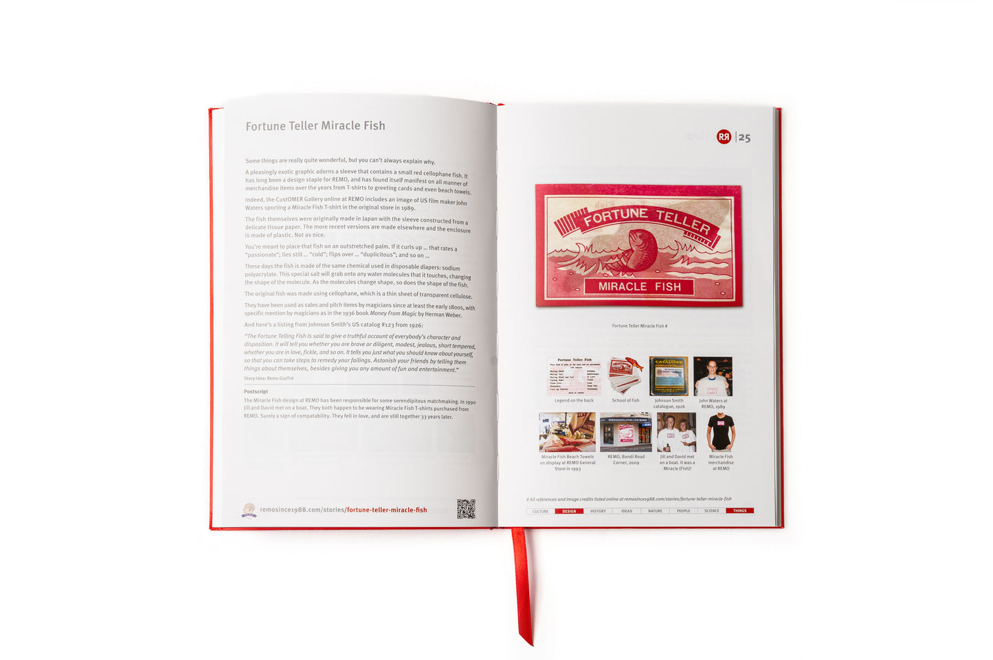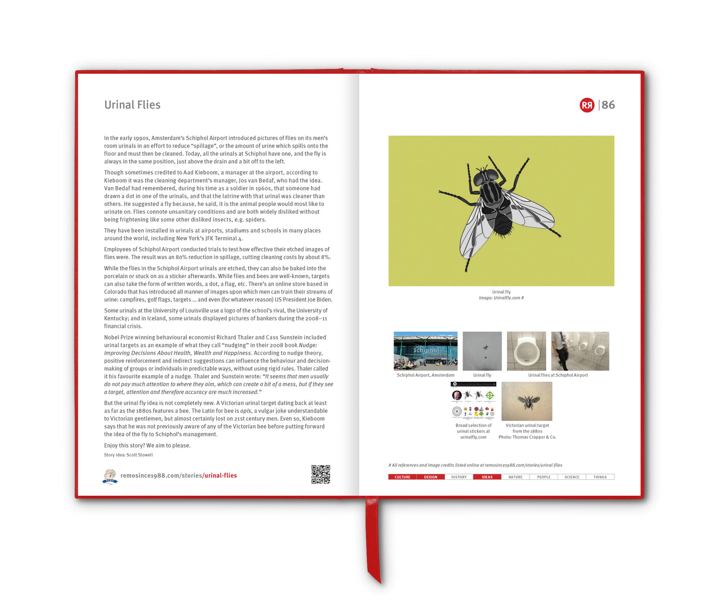

Technically, it’s not a map. It’s a diagram.
The London Underground, the world’s first subterranean railway, opened in 1863 with a modest stretch of track between Paddington and Farringdon. For decades afterwards, its maps tried to represent the sprawling network geographically, with stations placed according to their actual positions on the city’s streets. This worked tolerably well when the network was small, but as more lines were added and extended into the suburbs, the maps became tangled, cluttered and hard to read. By the early 1930s, the Underground’s diagram was looking very tangled indeed, limiting its functionality as a navigational aid.
The breakthrough came in 1931 from an unlikely source: Harry Beck, a 29-year-old technical draftsman who worked for the Underground on electrical circuit diagrams. Beck realised that passengers didn’t need an exact street-level geography to plan their journeys. What mattered was the order of stations, and where they connected to what.
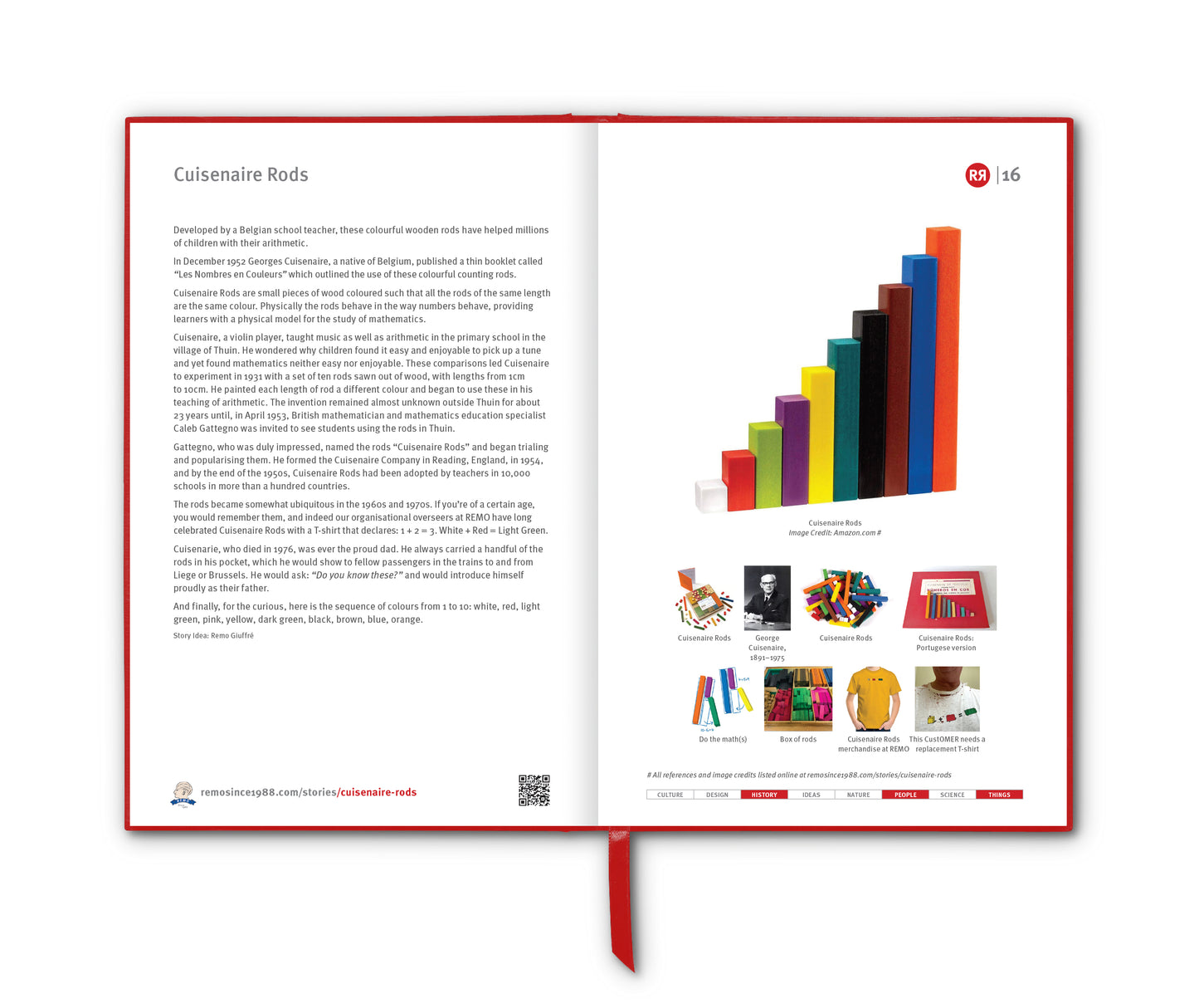
Applying the visual logic of wiring schematics, he redrew the network using straight lines (horizontal, vertical, or at 45° angles), equally spaced stations and a simplified background. The River Thames was the only geographical feature retained. Crucially, Beck also expanded the central area for clarity and compressed the distant suburbs, making all parts of the network equally legible.
Beck submitted his design to management, who were initially sceptical, it being such a radical and "revolutionary" departure from convention. However, a trial print run in 1933 was an immediate success with passengers. It was clear, modern and, most importantly, functional. This was not just a better map; it was a conceptual shift in cartography. By abandoning geographic accuracy in favour of diagrammatic clarity, Beck created a new kind of navigation tool: one that favoured usability over realism.
The influence of Beck’s map has been enormous. First, it set the template for nearly every metro map in the world – from New York and Paris to Tokyo and Sydney. The principles he pioneered – straight lines, consistent angles, colour-coded routes and schematic spacing – are now global design standards.
Secondly, it became an enduring symbol of London itself. The coloured lines and distinctive typeface (Johnston) form part of the city’s visual identity, instantly recognisable even without the Underground "roundel" – itself, and since 1908, one of the most recognised and imitated logos in the world.
The map also seeped into popular culture. Designers, artists, and satirists have endlessly adapted its form: parody maps replacing stations with film titles, musicians or slang terms; artworks exploring the elegance of its lines; and merchandise ranging from tea towels to T-shirts and boxer shorts. Its abstract beauty – born from function – made it an icon of modernist design, celebrated in museums and design histories.
Although Beck was never formally credited by London Transport during his lifetime, his work has since been recognised as one of the most influential pieces of information design of the 20th century.
In 2013, 80 years after his diagram first landed in the hands of grateful Underground passengers, English Heritage unveiled a blue plaque [RR3:10] on a terraced house in Leytonstone: “Harry Beck 1902–1974 Designer of the London Underground map was born here”.
Postscript
Transport for London (TfL) does in fact produce and host a geographically accurate "London Connections" map of its rail network, but they do not actively promote it to the public. The map was created initially for internal engineering and planning purposes – not for everyday customer use.
__________________________
References
wikipedia.org/wiki/Tube_map
wikipedia.org/wiki/Harry_Beck
theconversation.com/sublime-design-the-london-underground-map
theguardian.com/artanddesign/2013/mar/25/harry-beck-tube-map-designer-honoured-blue-plaque
buzzfeed.com/patricksmith/theres-now-a-tube-map-that-shows-what-london-actually-looks
designboom.com/art/london-underground-map-reinterpreted
Images
1. Harry Beck in 1968. Credit: Ken Garland Estate. Tate Gallery by Tube by David Booth of the agency Fine White Line.
2. Map of Underground lines, 1908
3. Earliest known drawing of the Underground's standard bullseye design (known as the roundel after 1972), as re-designed by Edward Johnston in 1925.
4. Harry Beck’s map design for London Underground, 1933
5. Present day London Underground Overground DLR Crossrail map
6. Tube Map boxer shorts. Credit: bhbrands.co.uk
7. Untitled artwork by David Shrigley for the cover of the London Underground Pocket Tube Map, 2005
8. The Truth About Harry Beck (2024), written and directed by Andy Burden at the Cubic Theatre, London. Transport Museum. Photo credit: Mark Douet
9. Piece of geographically accurate "London Connections" map, 2015